IARA
CARDEIRA
PROJECTS
︎The Colour Swatch
︎Chelsea x Camberwell
︎Scan Here
︎Type Specimens
︎Posters
Works
To Date
Porfolio
︎2021 - 25’
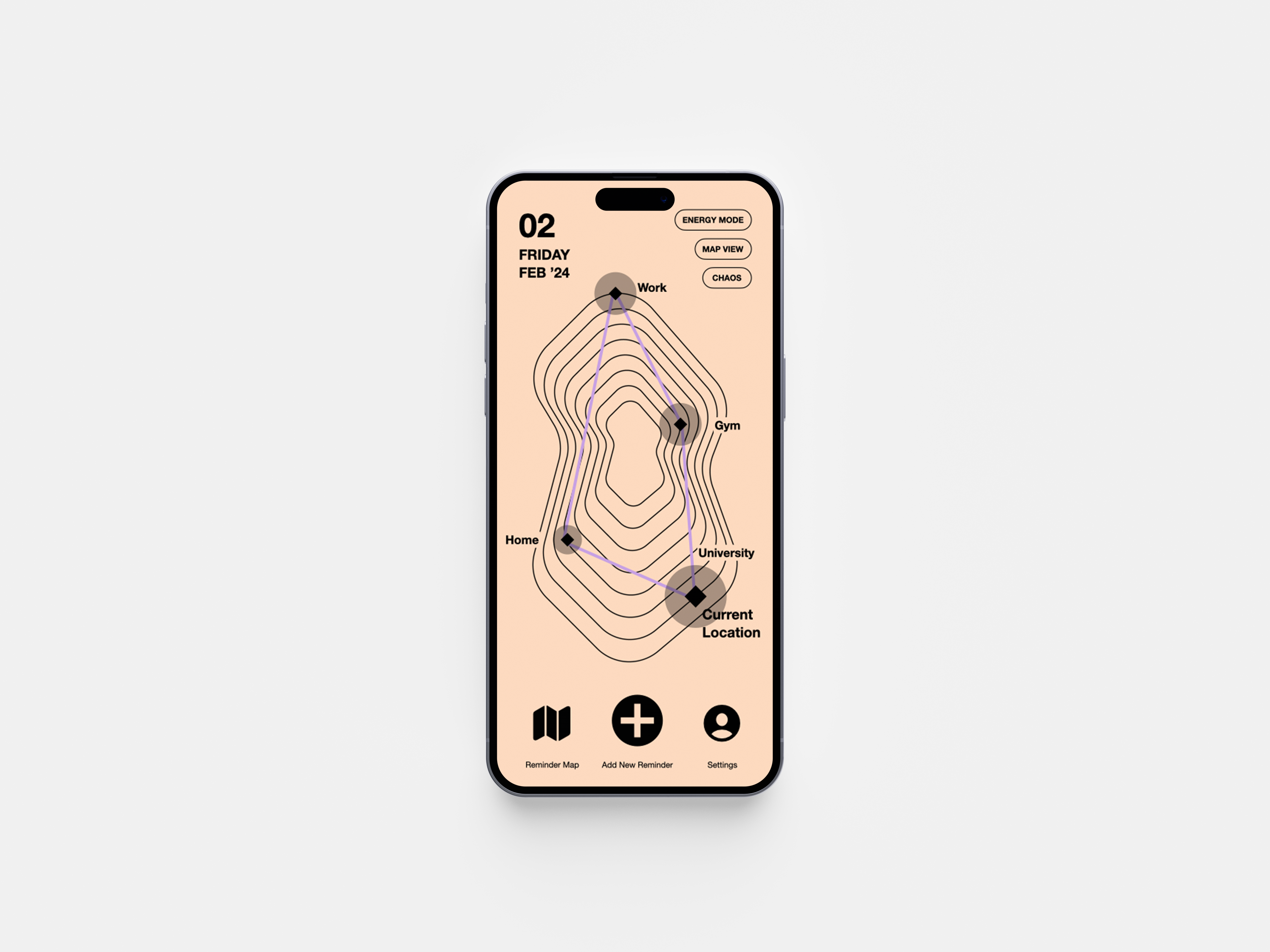
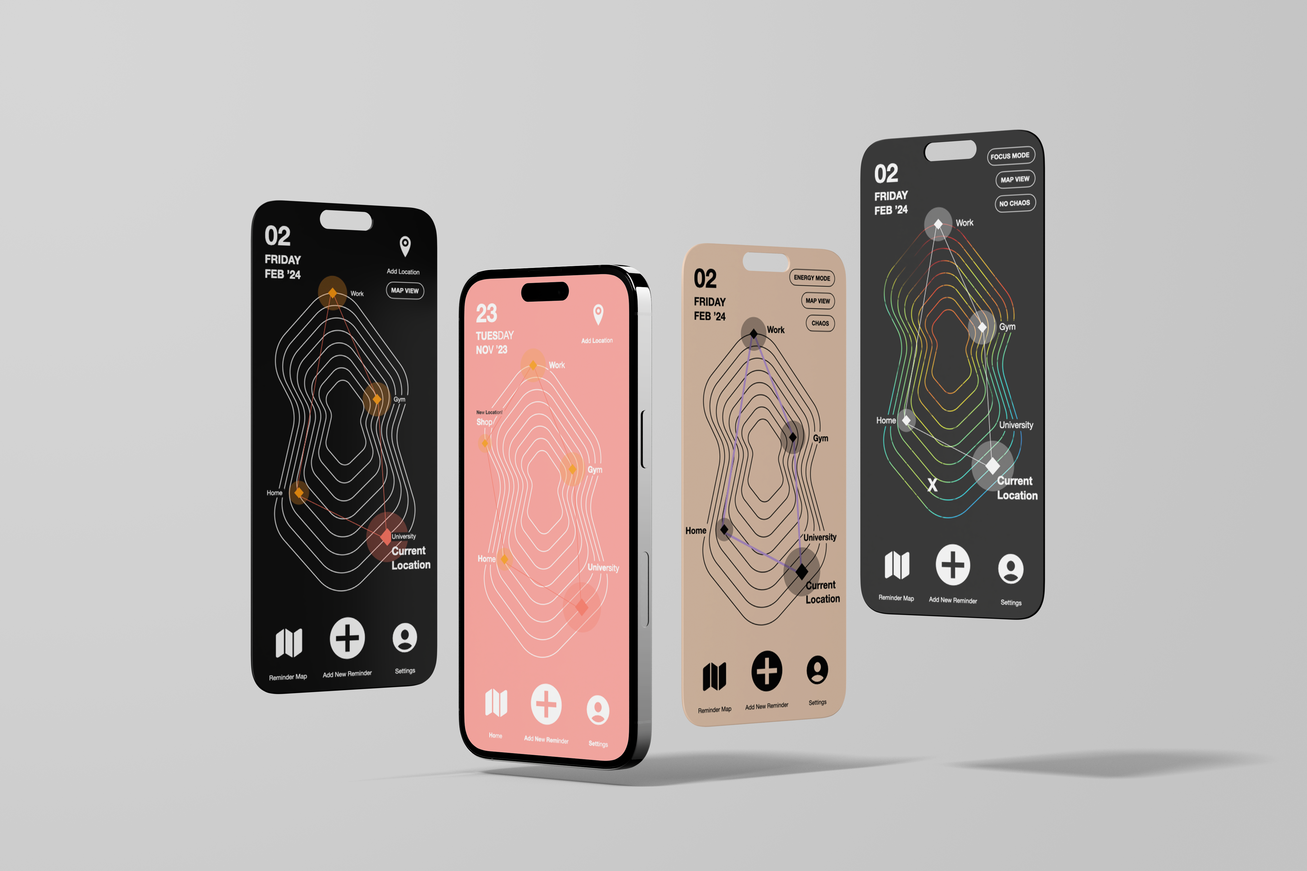
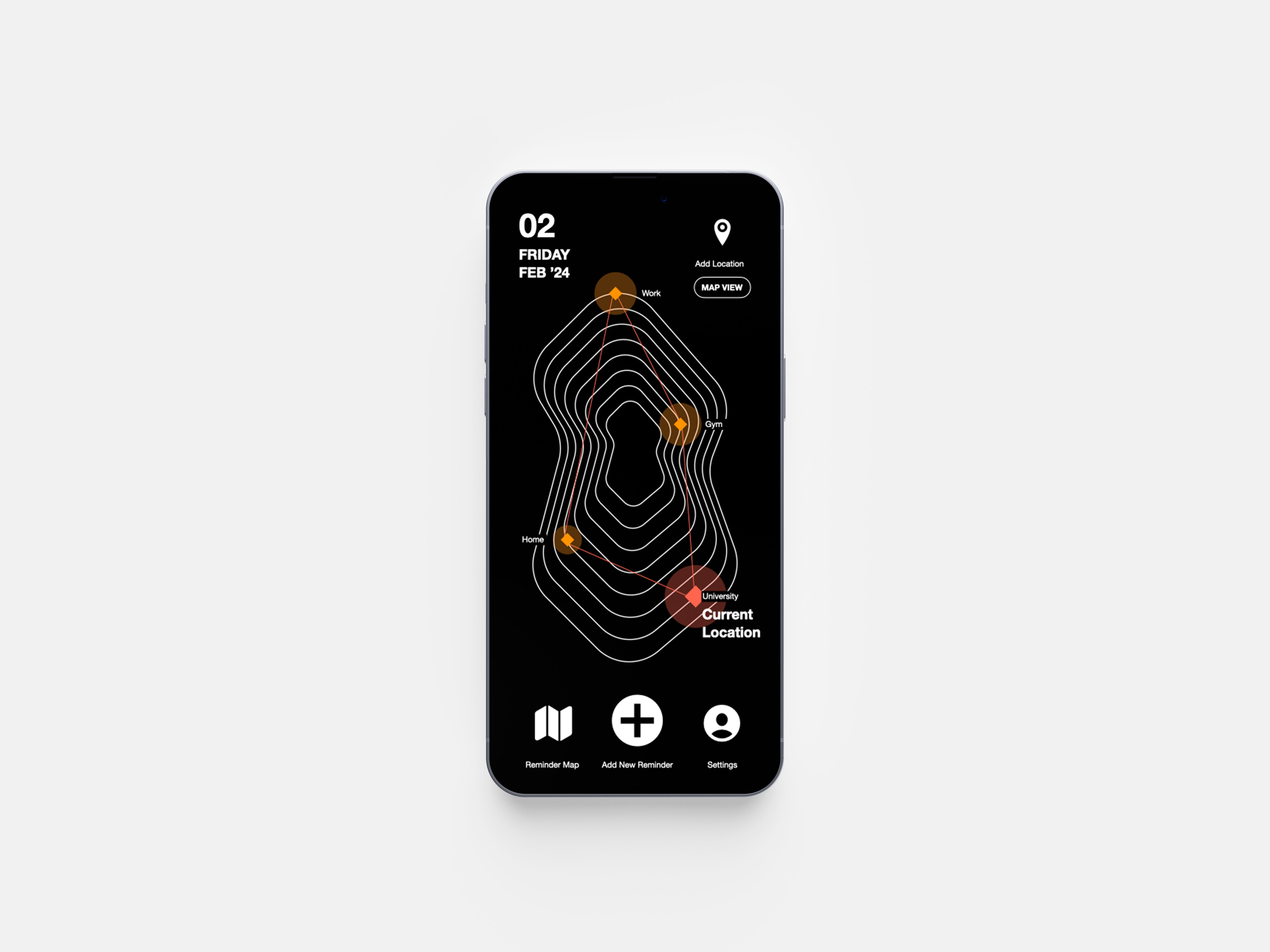
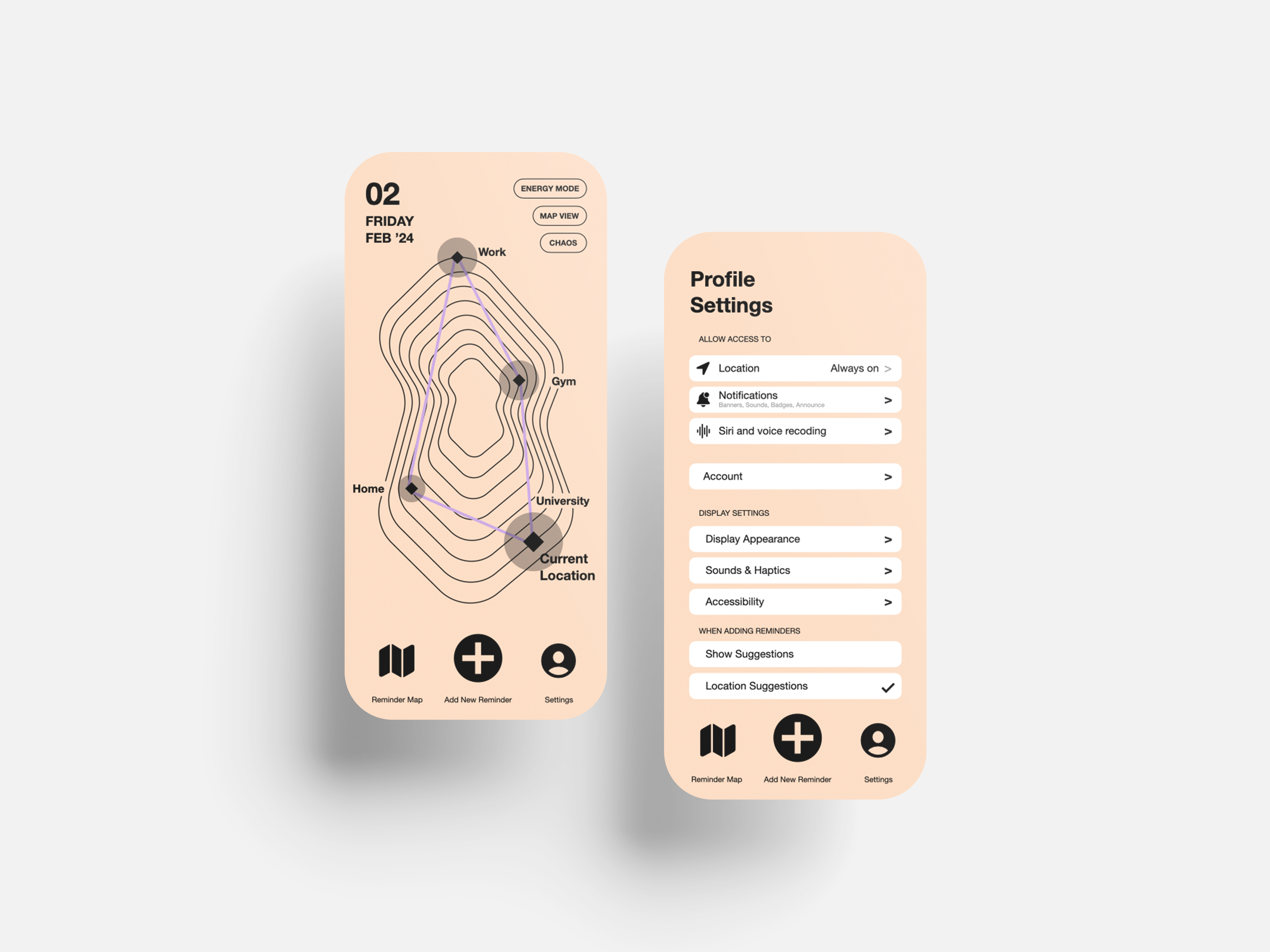
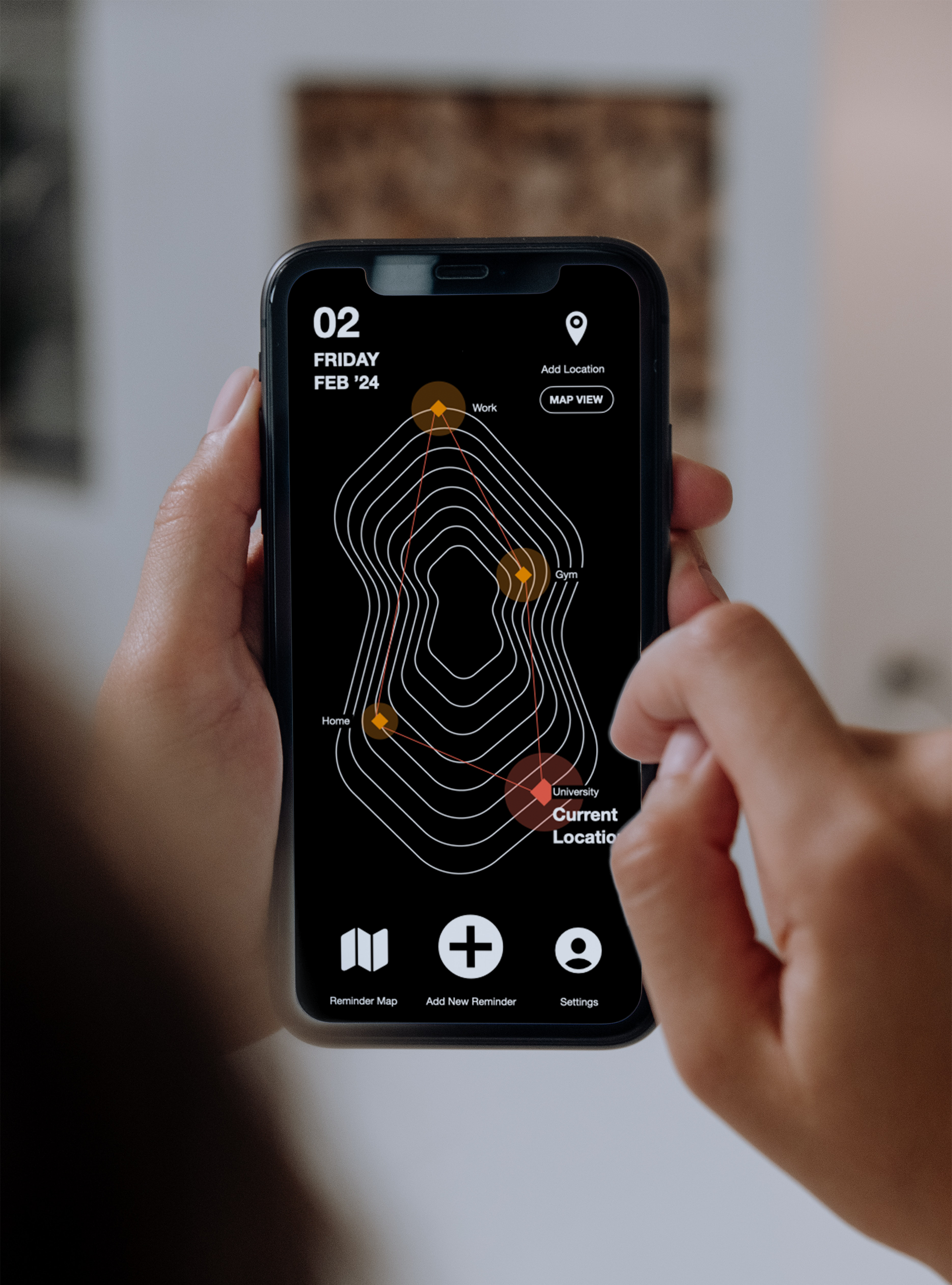
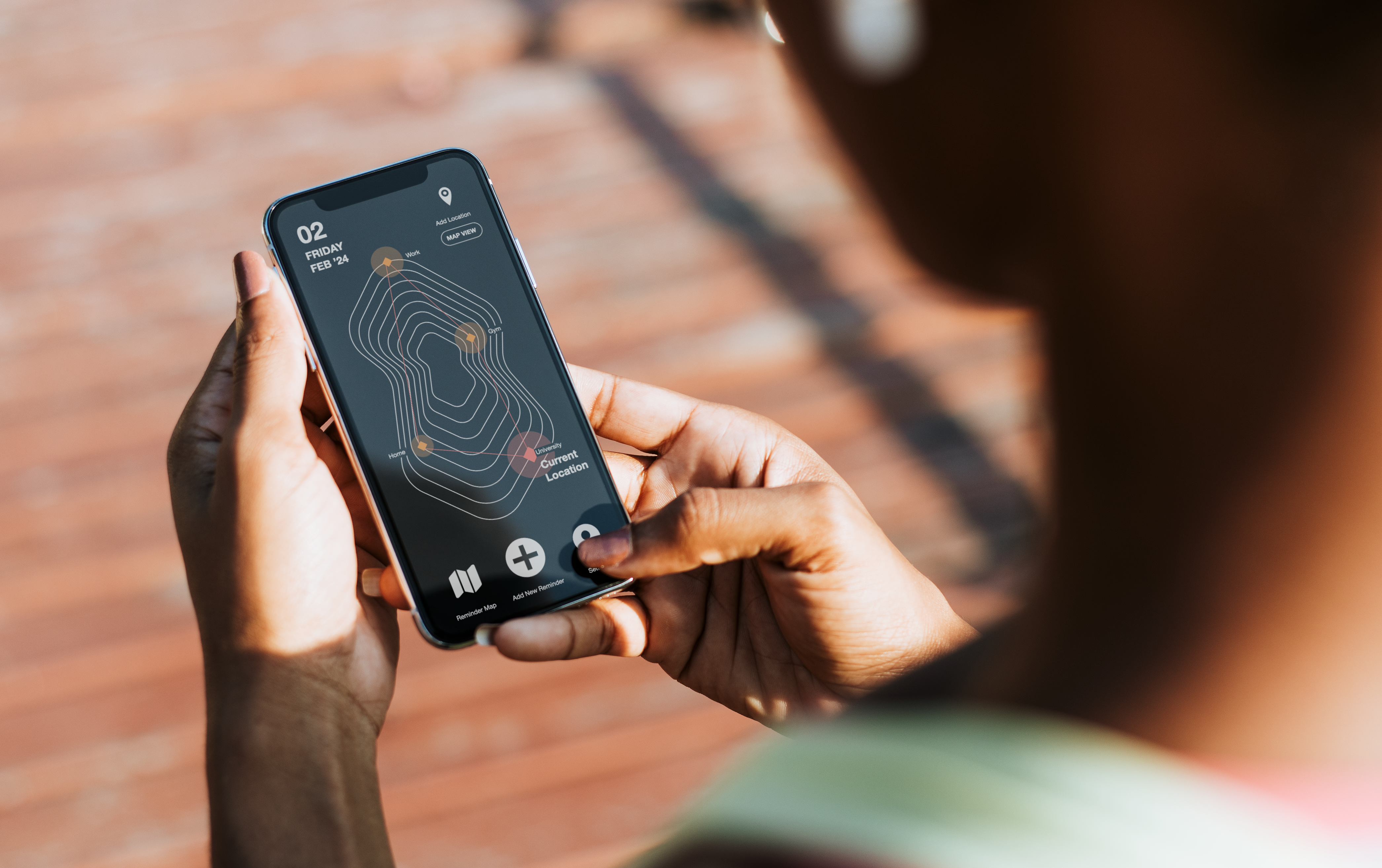
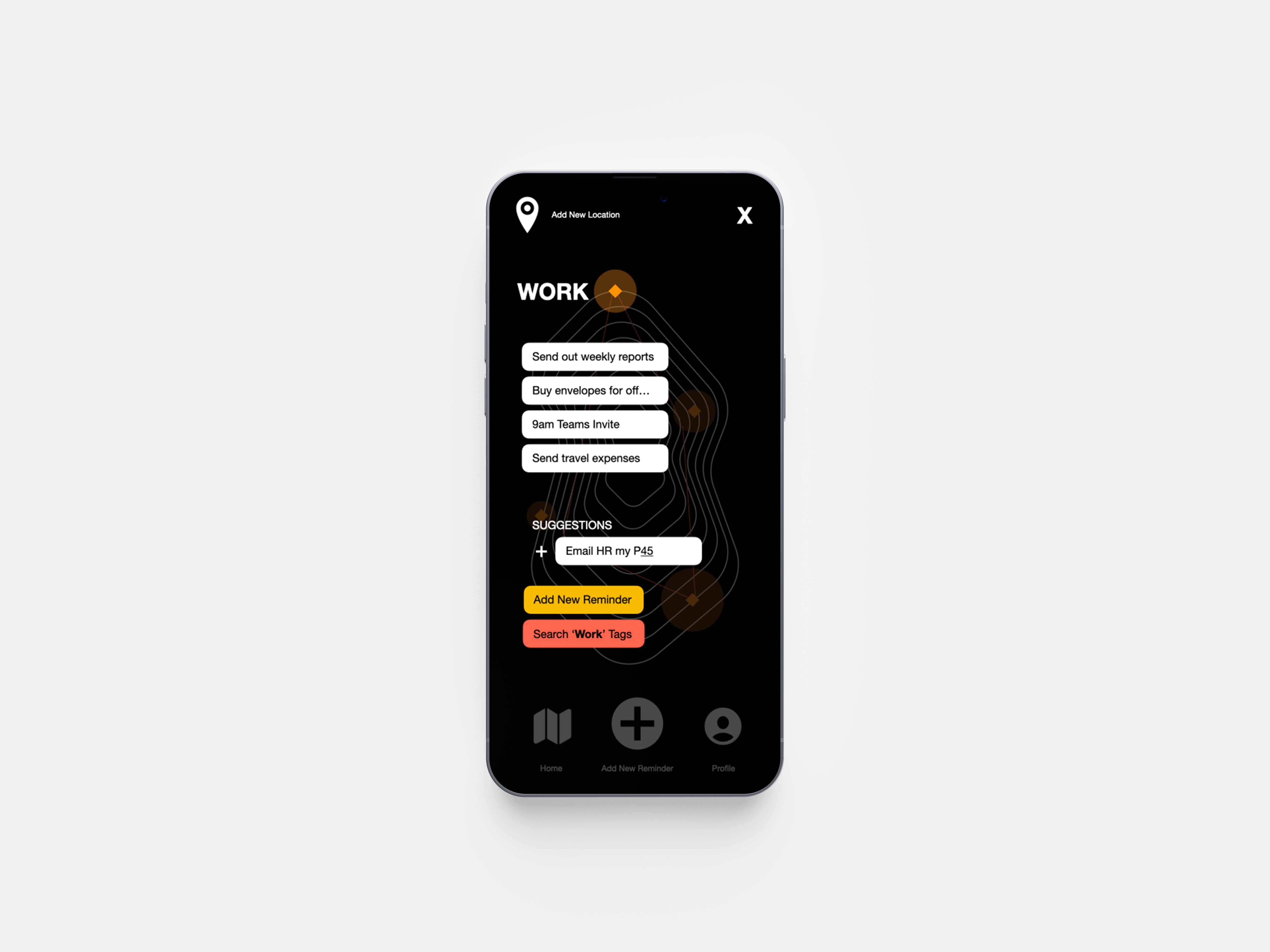
App Design: A Location based reminder app.
RADAR
London, January 2024
The RADAR app automatically reminds you of your to-dos when you arrive at your saved locations, ensuring nothing slips through the cracks, whether it’s at home, work, or school.
For this project, I was inspired by fitness tracking apps and mapping aesthics to enhance the location focused intention of the app. I used colours that encourage productivity and focus such as reds and oranges and through reasearch I have also used colours from proven studies that help neurodivergent people engage with the content more effciently.
In order provide increased accessibility, since this app’s main target audience is people with neurodivergence, I have incorporated Bionic reading which is a proven method for better comprehension when interacting with text based content. See Radar’s full capabilities here.
Images
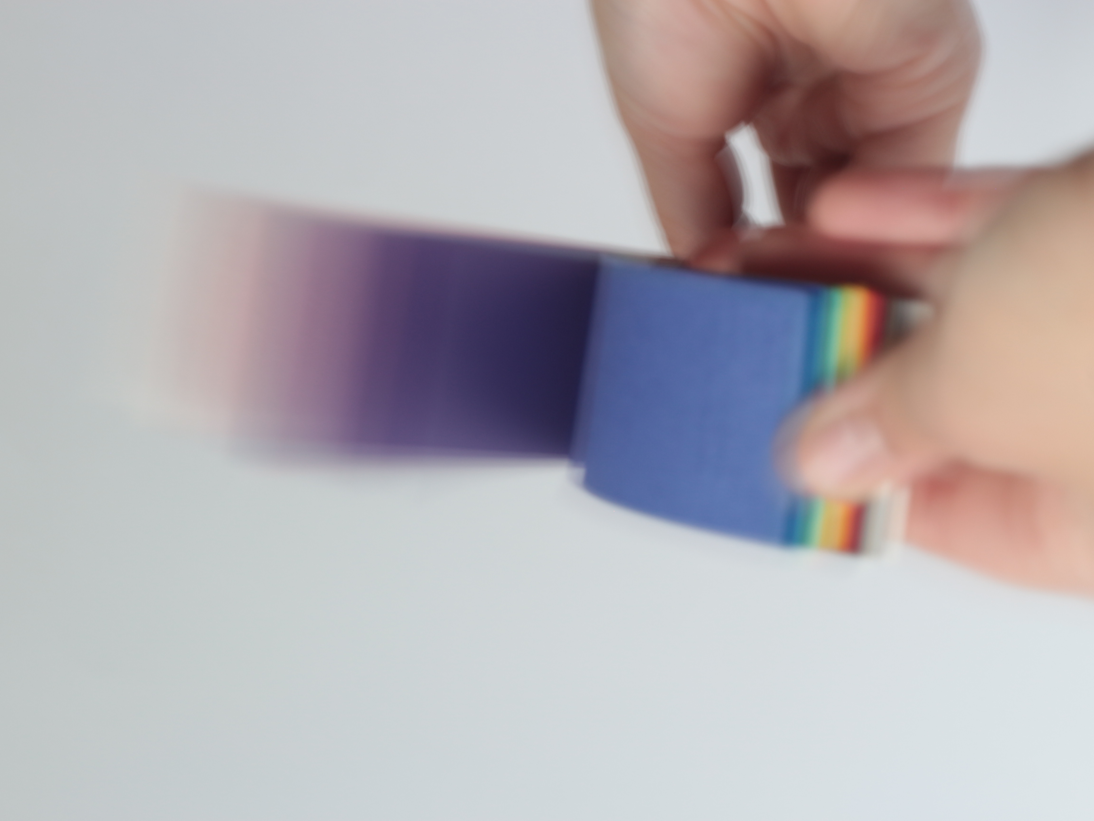
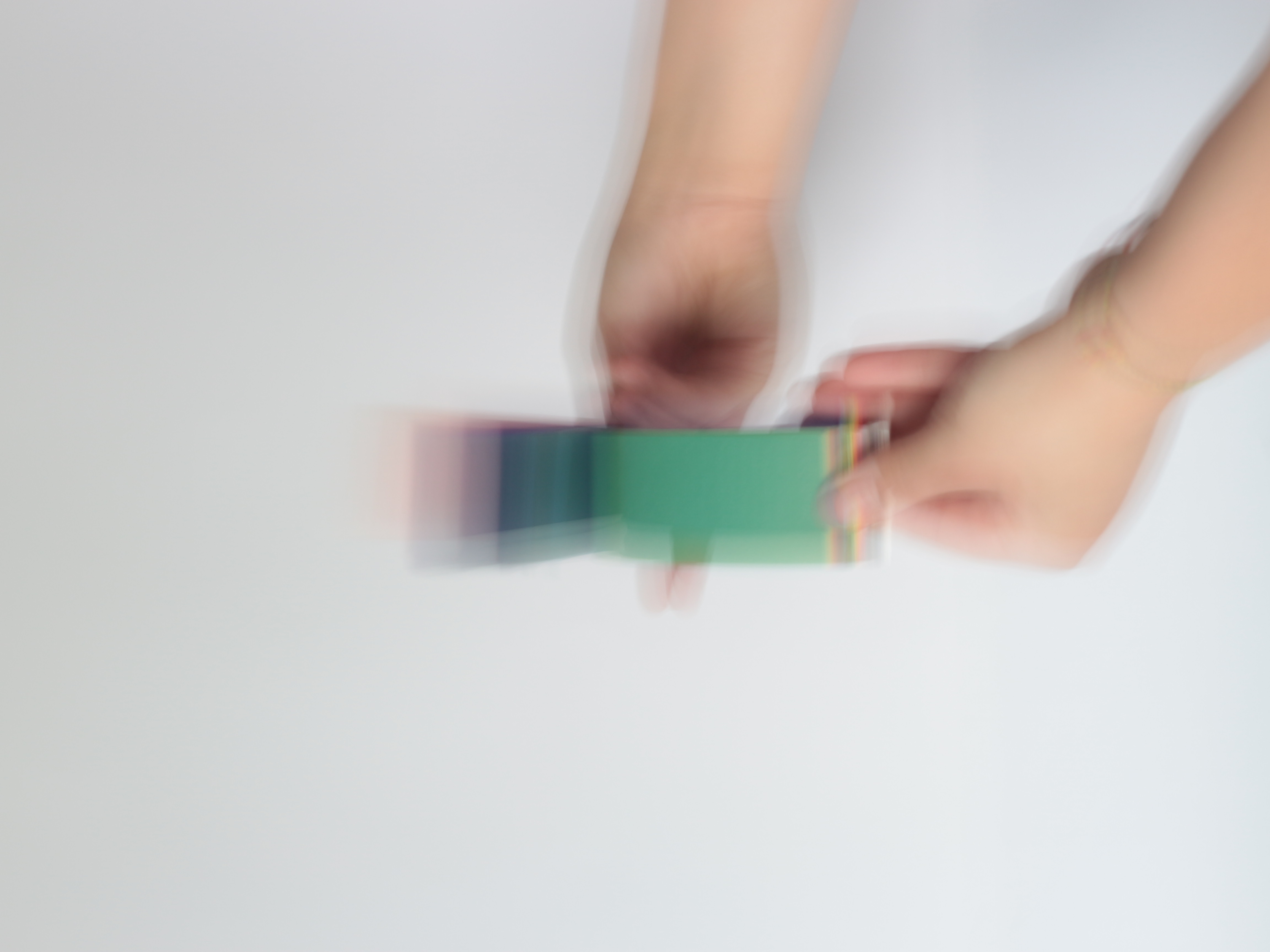
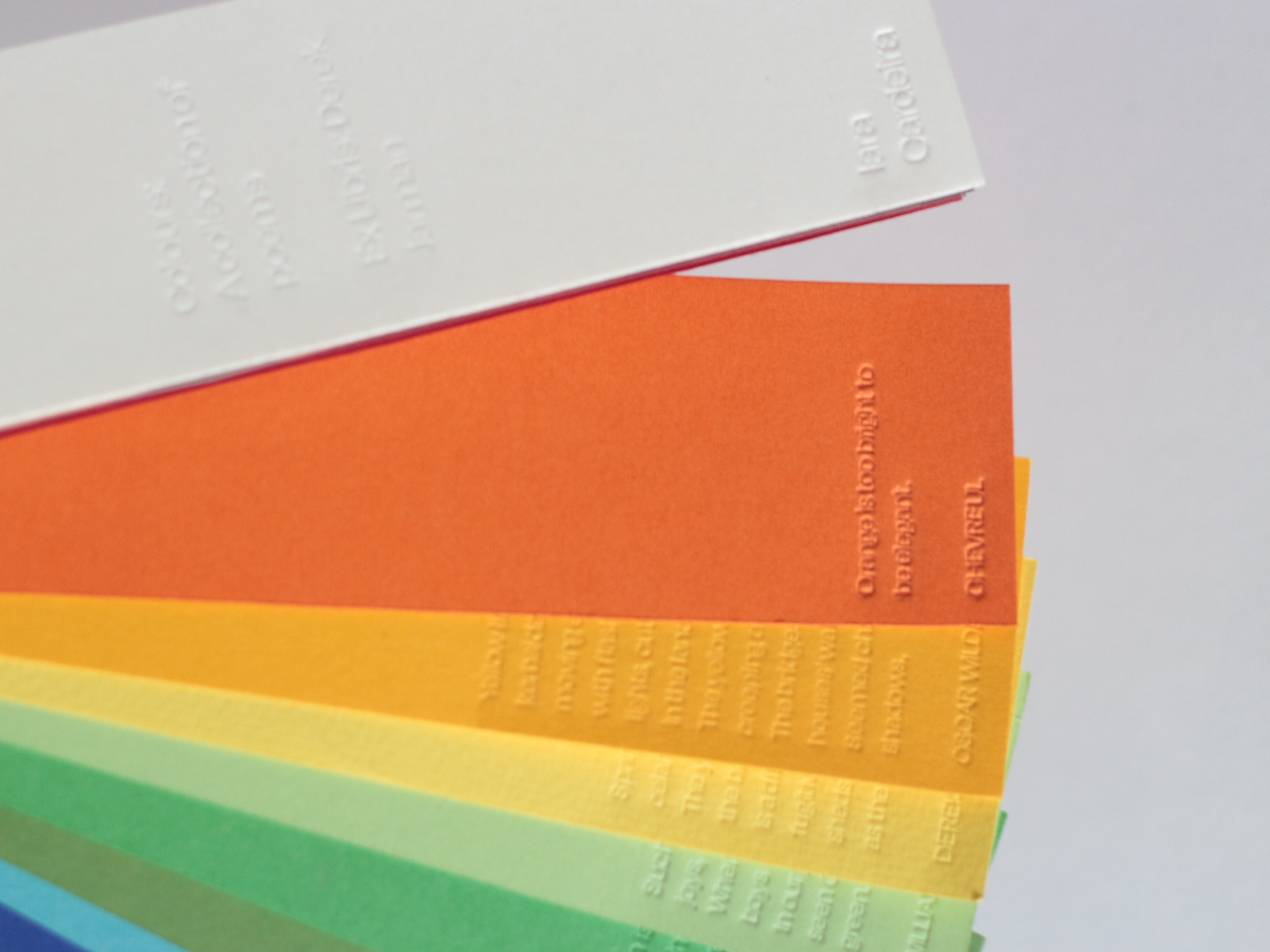
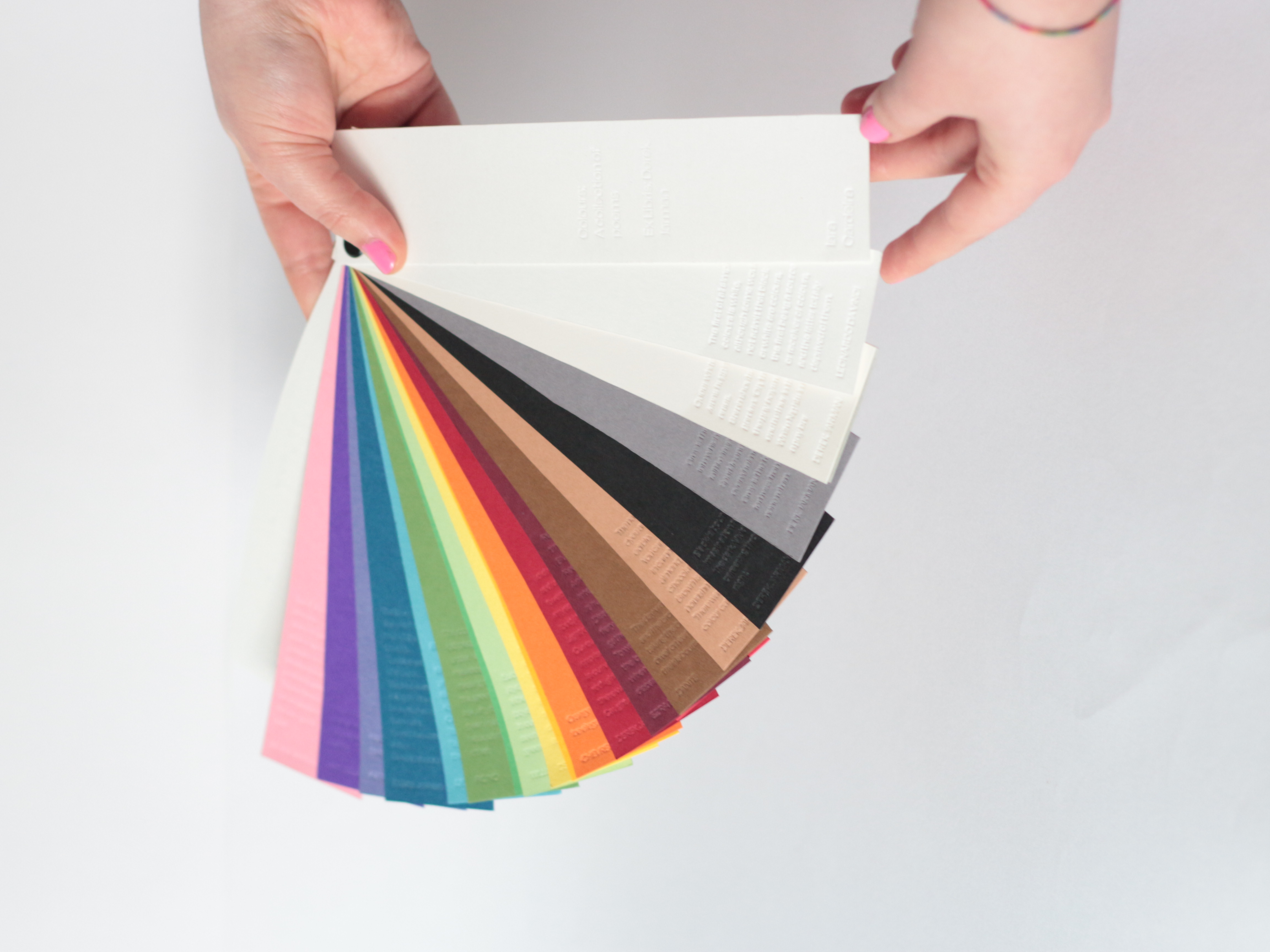
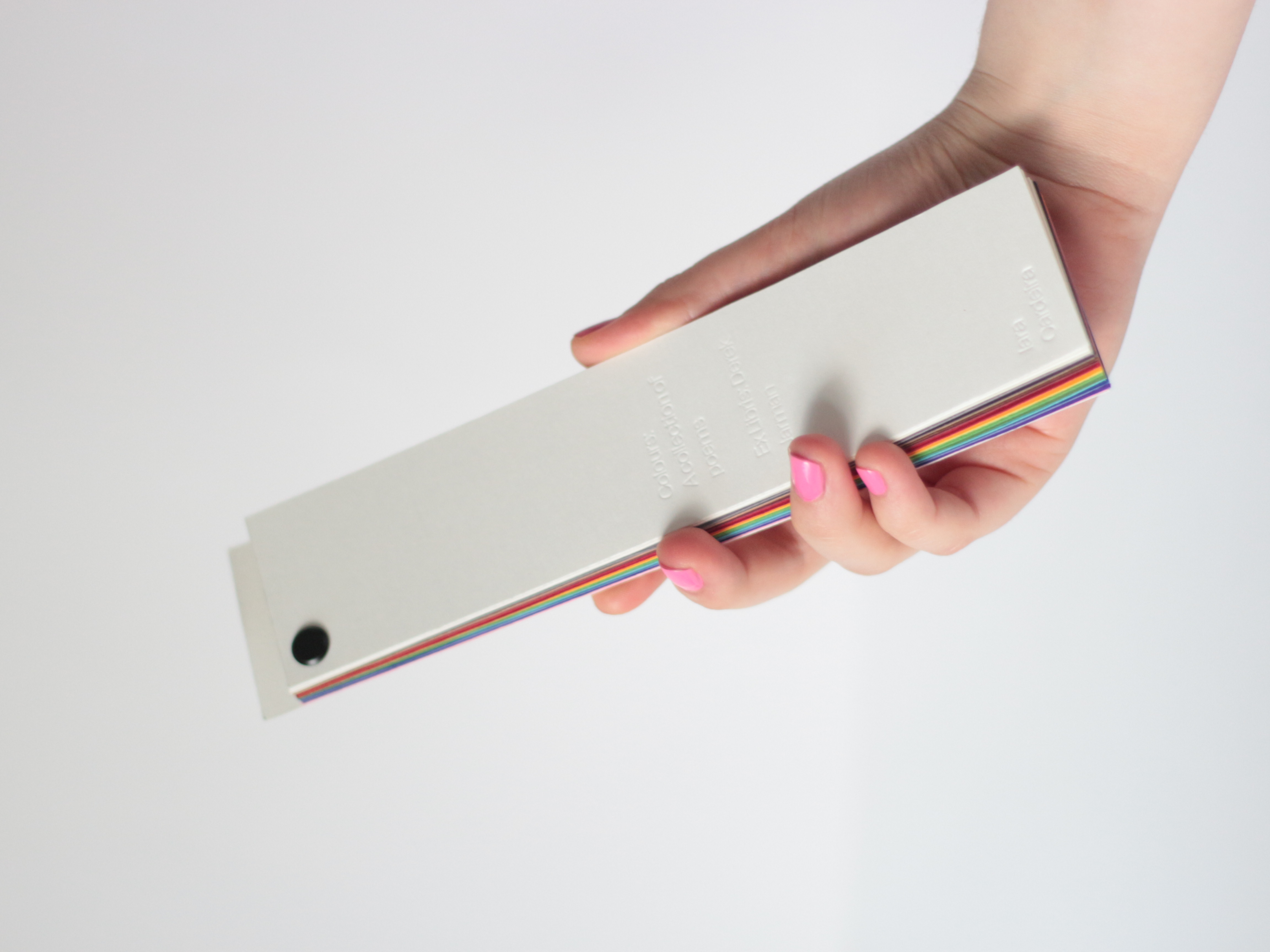
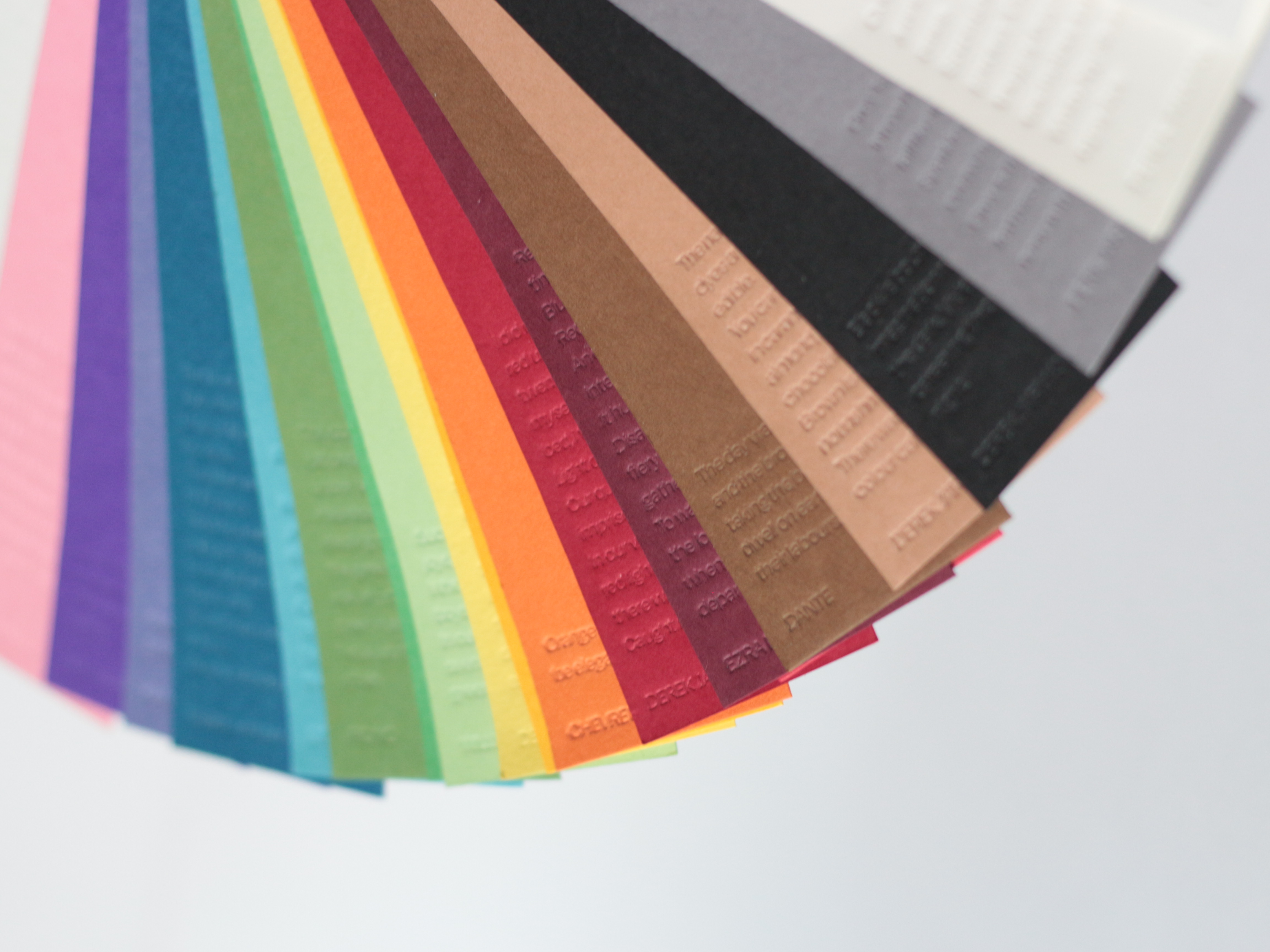
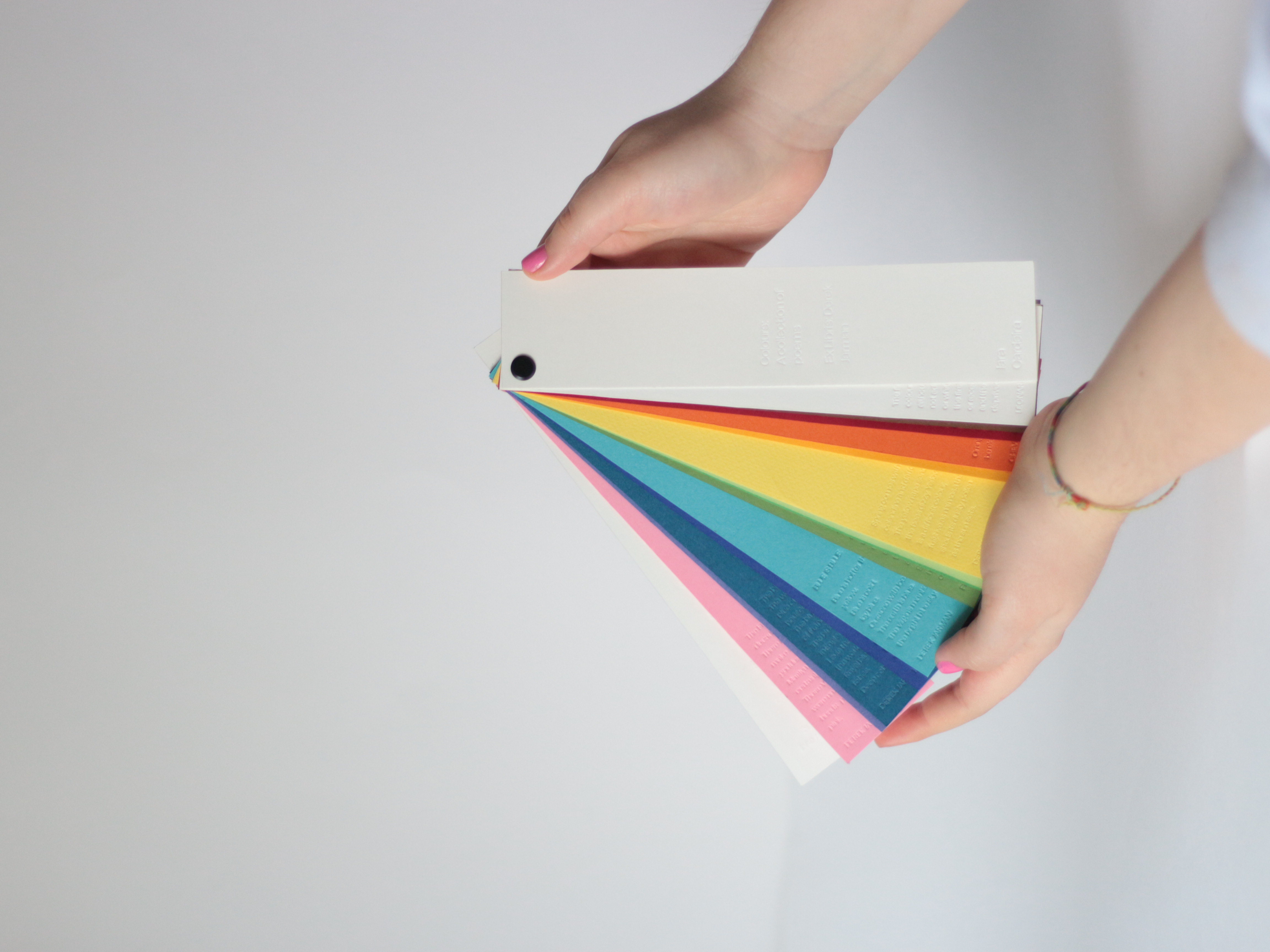
Colours: A Collection of Poems
The Colour Swatch
London, February 2023
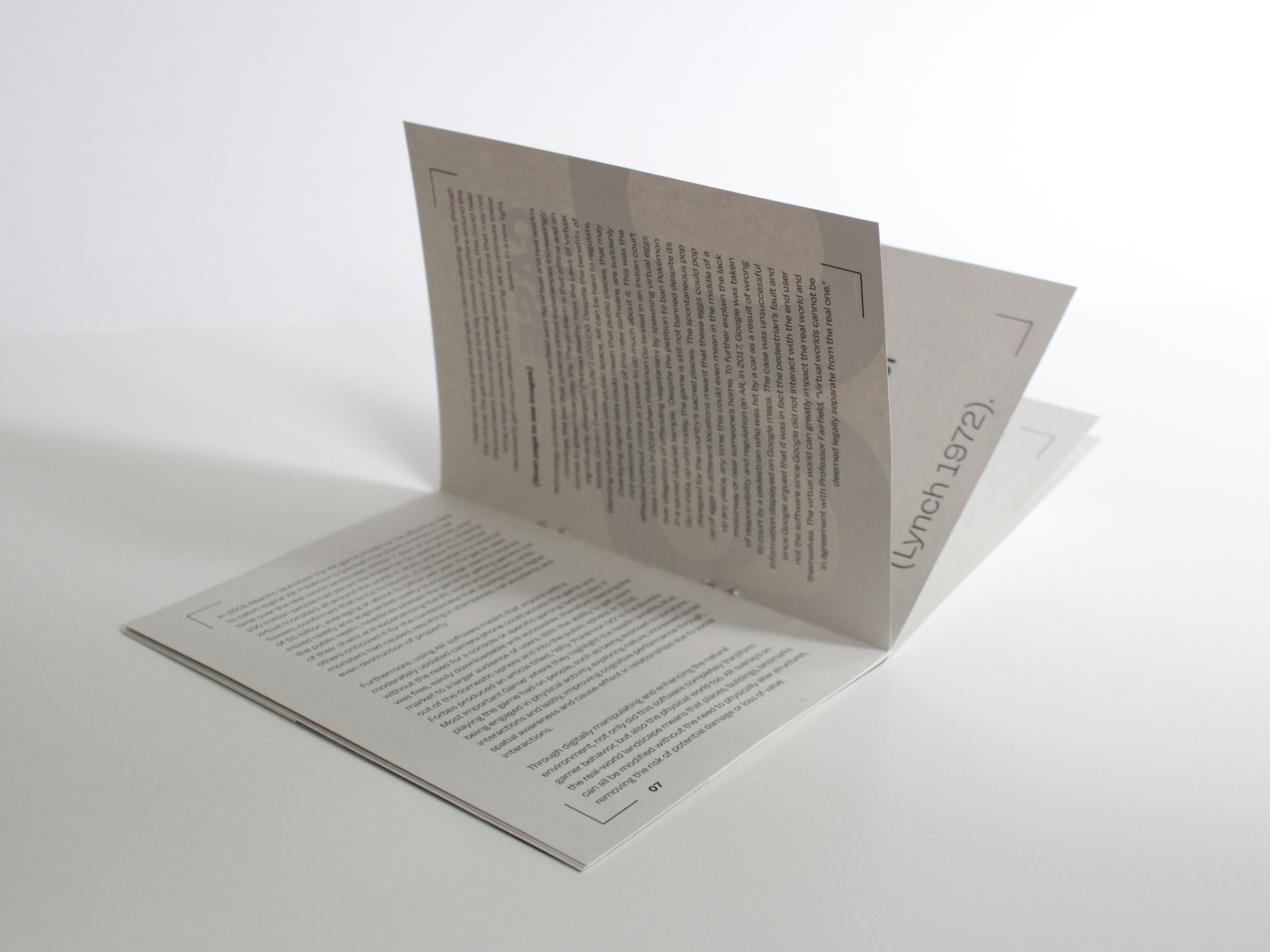
In the 1993 book, Chroma: a book of colour, Derek Jarman takes us
into a queer gaze of colour, exploring his own experiences in relation to
colour, disunderstandings and identity. Taking inspiration from Jarman’s work, I extracted and compiled a collection of queer creatives and
literary geniuses’ stories about colours to challenge my own experiences
of being disunderstood rooted in colour, representation and identity. These
writings dissect how systems, economies, cultures and countries
perceive colours, sculpting colours from a pigment into a poem of stories.
Images

UAL Collaboration: Chelsea x Camberwell
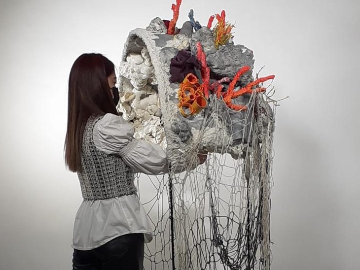
Future Coral
London, December 2022
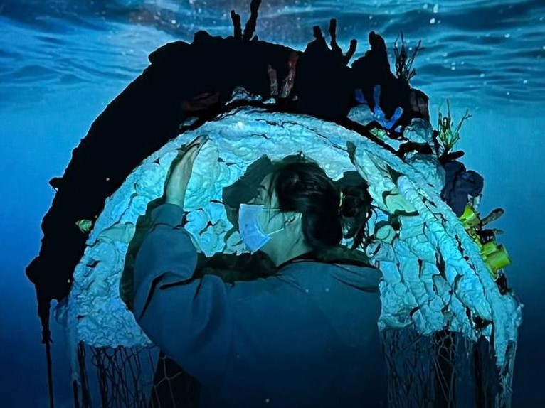
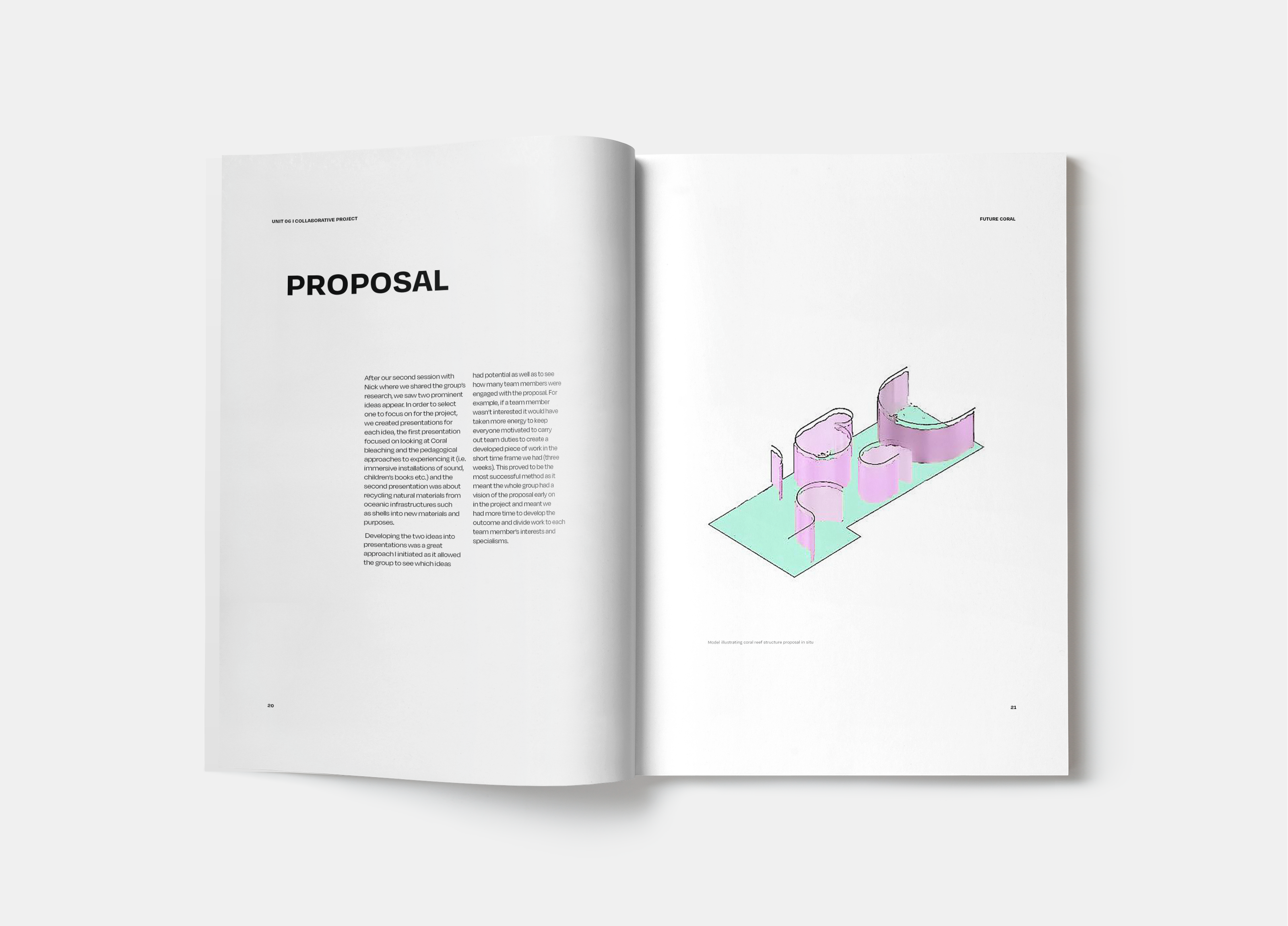
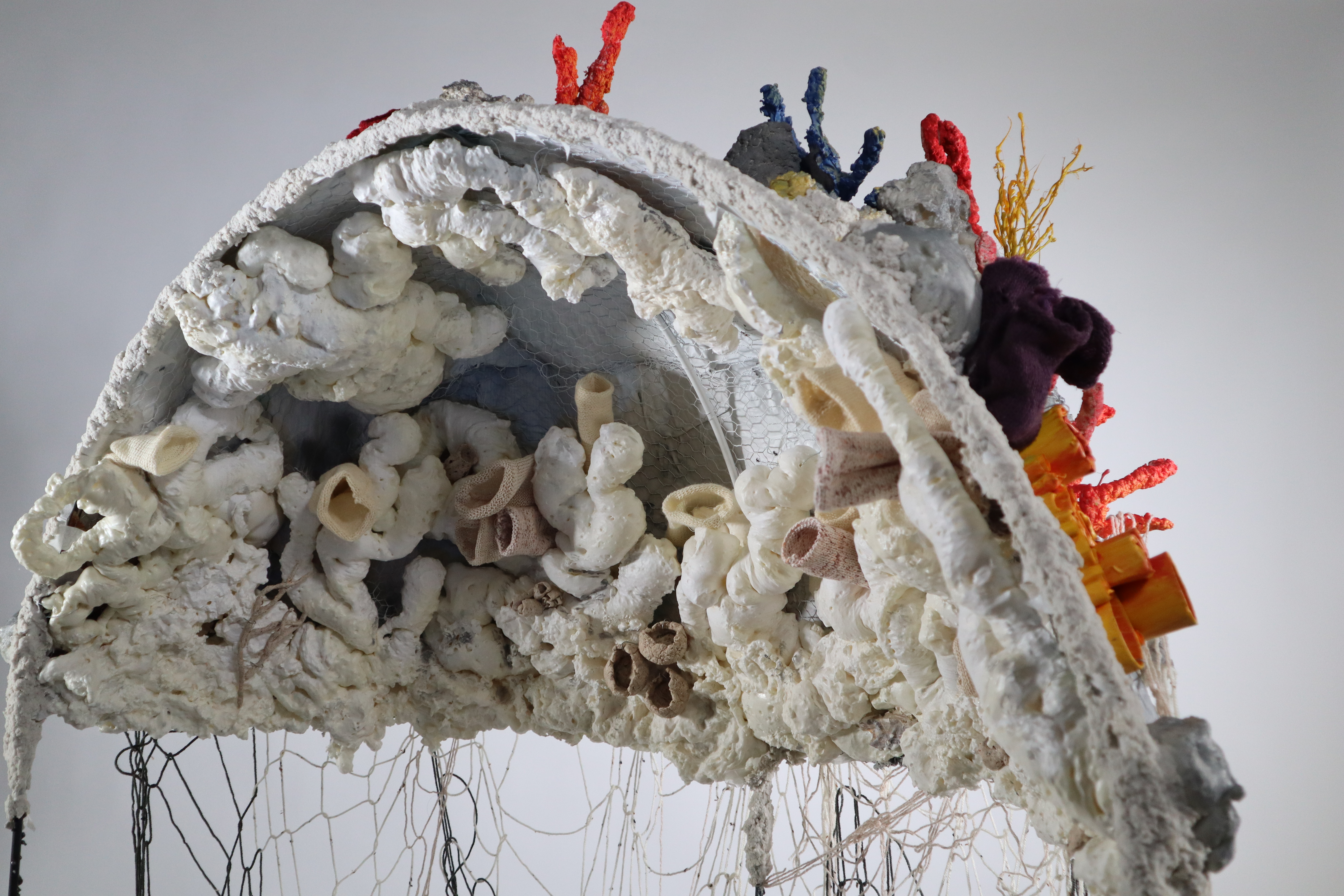
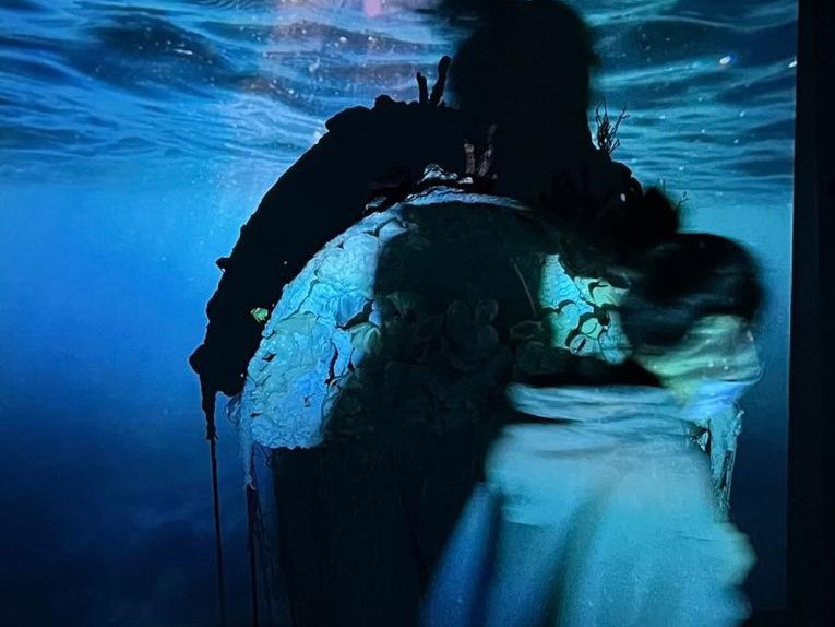
Future Coral is an immersive structure, designed to communicate the transformation of coral reefs caused by human activity. The design is a multisensory experience that aims to educate children (6 – 8 years) through using sound, smell and texture to inspire children to think about how they could help address the issue. A range of materials were used to reflect the biodiversity, whilst the interior shows coral bleaching due to ocean acidification.
Through research we were curious about the issue of habitat loss, where we chose to focus on the destruction of coral reefs. A key issue was thinking about how we could address the problem facing coral reefs. This led to us thinking about how we could create an interactive experience to spread awareness of the issue.
An issue we faced when designing the structure was how we could suspend metal frames to offer a hanging immersive experience for people. However, this became a health and safety risk which led to issues on how it would suspend from the ceiling safely once exhibited. Through development we refined the structures stability enabling the design to become fully immersive and free standing.
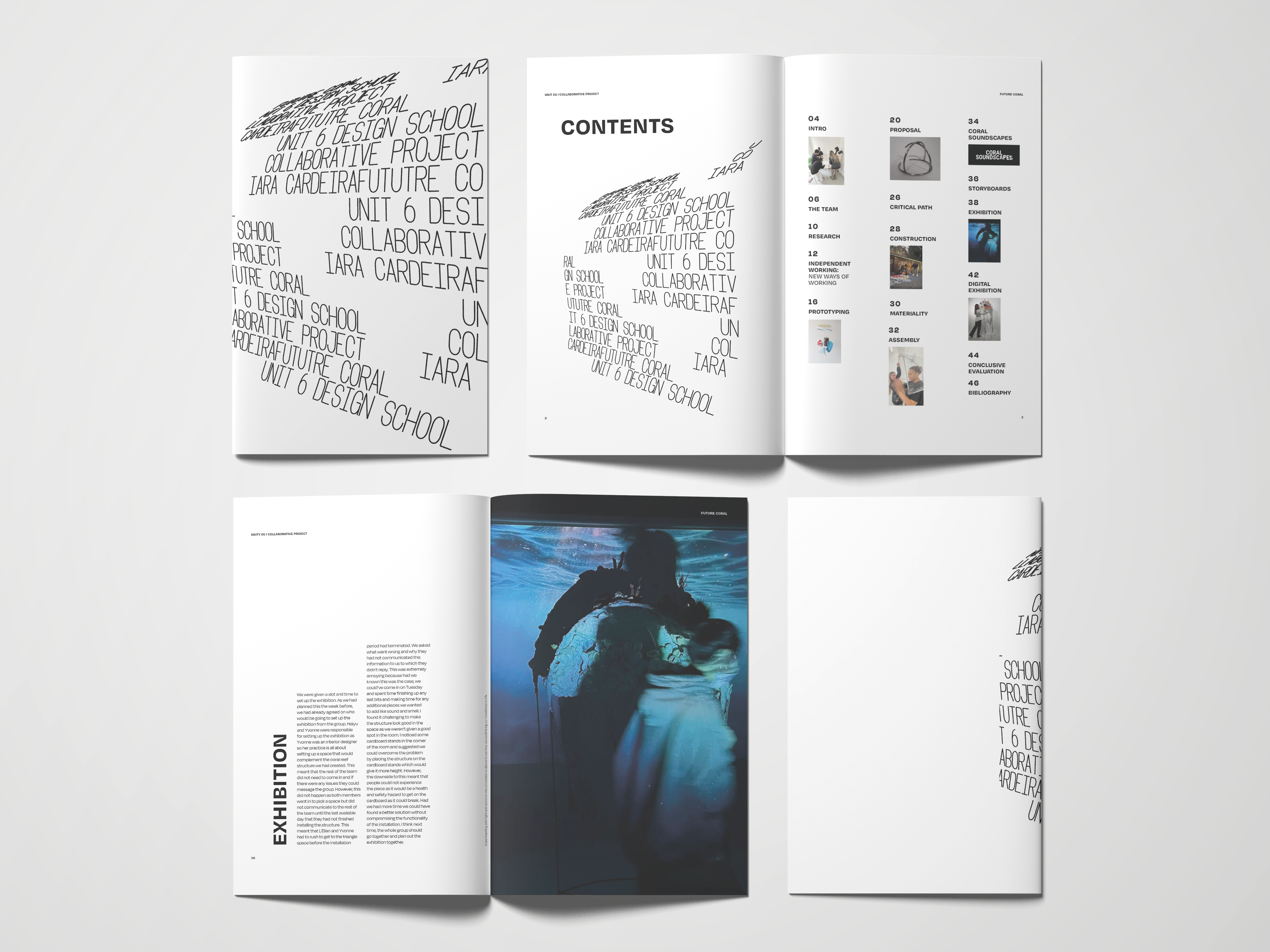
I designed an editorial style publication companion piece to go alongside the exhibiton that explained the different sensorial elements as well as an informational guide guide targeted to 6-8 years to visually show how coral bleaching happens.
Through research we were curious about the issue of habitat loss, where we chose to focus on the destruction of coral reefs. A key issue was thinking about how we could address the problem facing coral reefs. This led to us thinking about how we could create an interactive experience to spread awareness of the issue.
An issue we faced when designing the structure was how we could suspend metal frames to offer a hanging immersive experience for people. However, this became a health and safety risk which led to issues on how it would suspend from the ceiling safely once exhibited. Through development we refined the structures stability enabling the design to become fully immersive and free standing.
I designed an editorial style publication companion piece to go alongside the exhibiton that explained the different sensorial elements as well as an informational guide guide targeted to 6-8 years to visually show how coral bleaching happens.
Images
Augmented Reality, A Digital pop up book
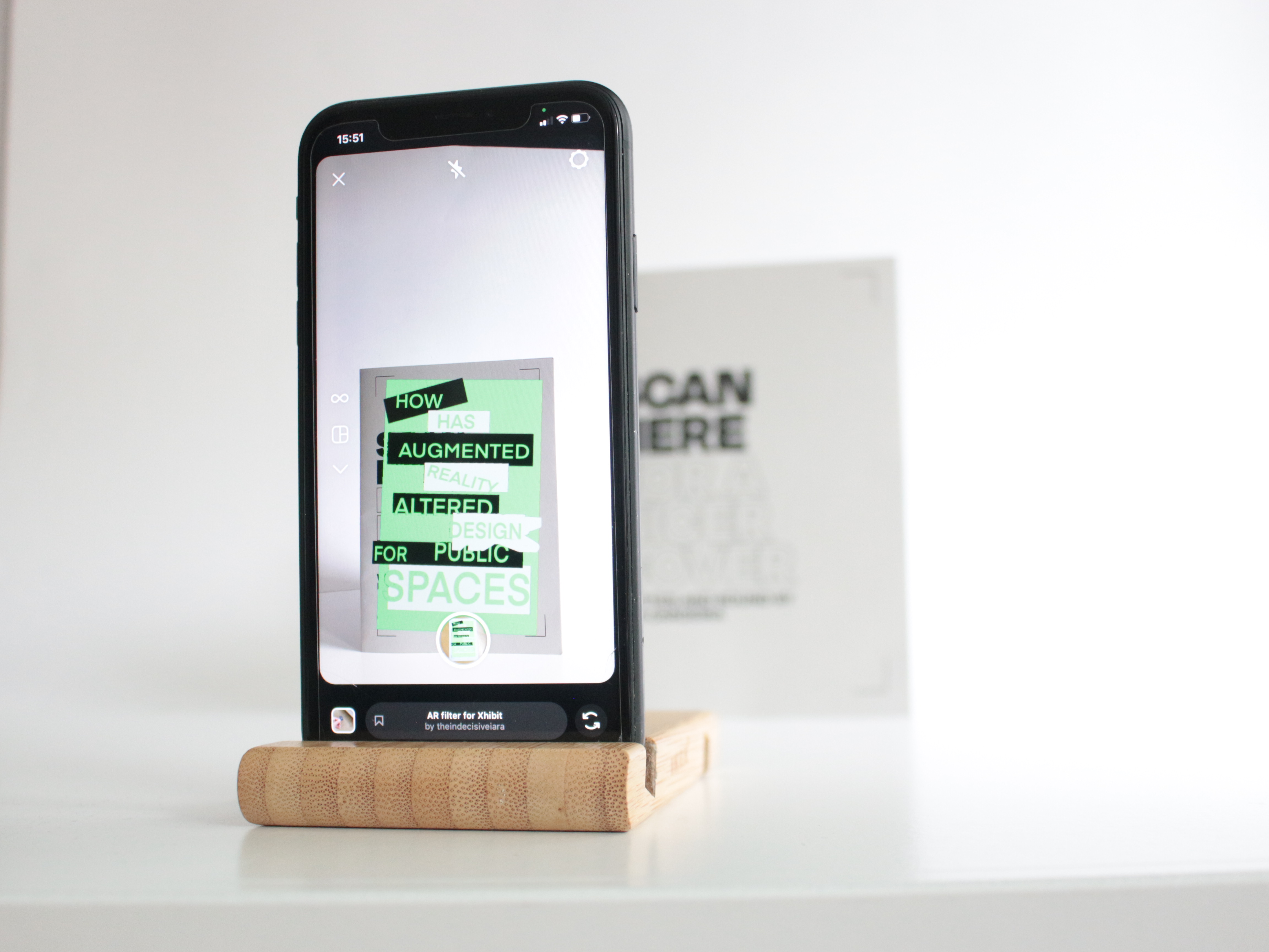
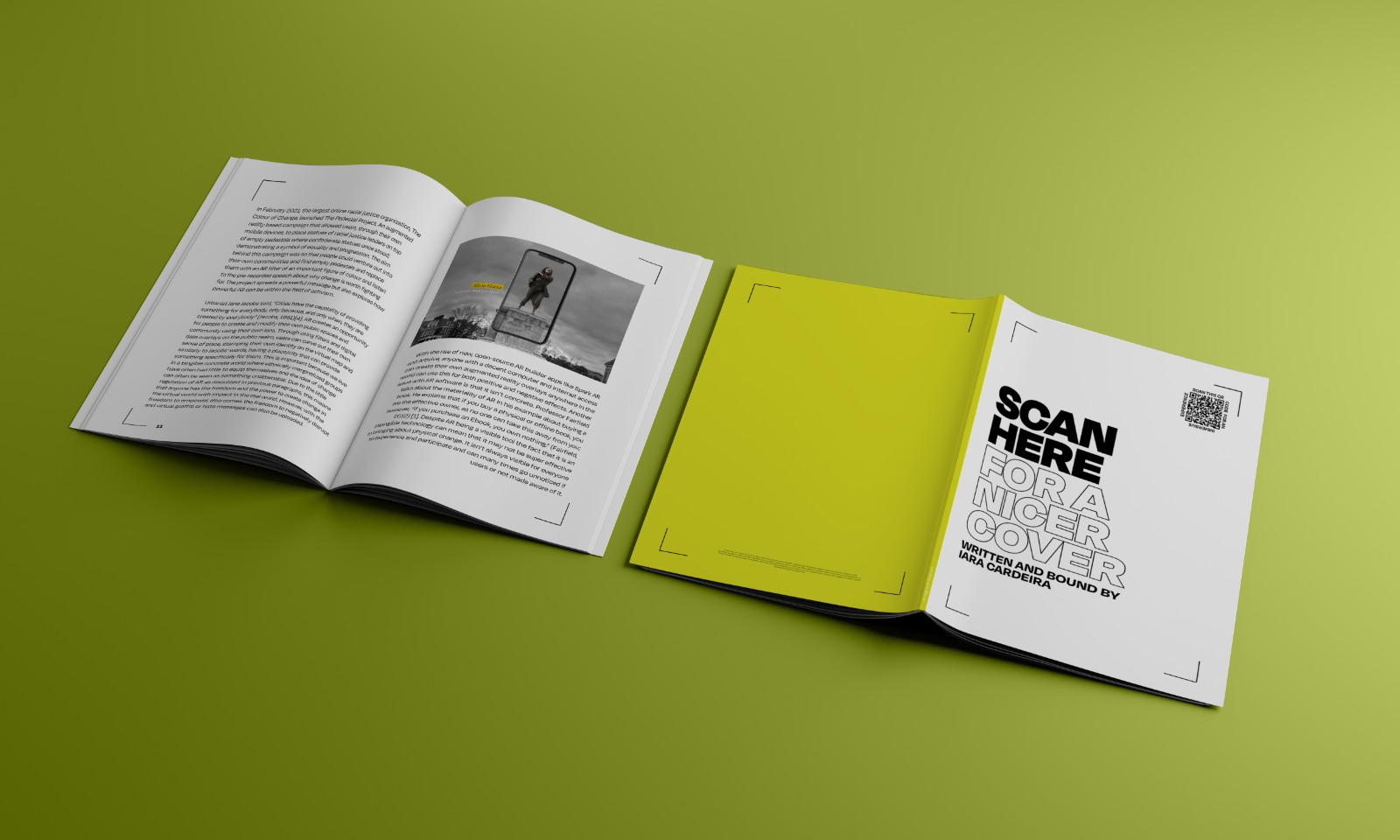
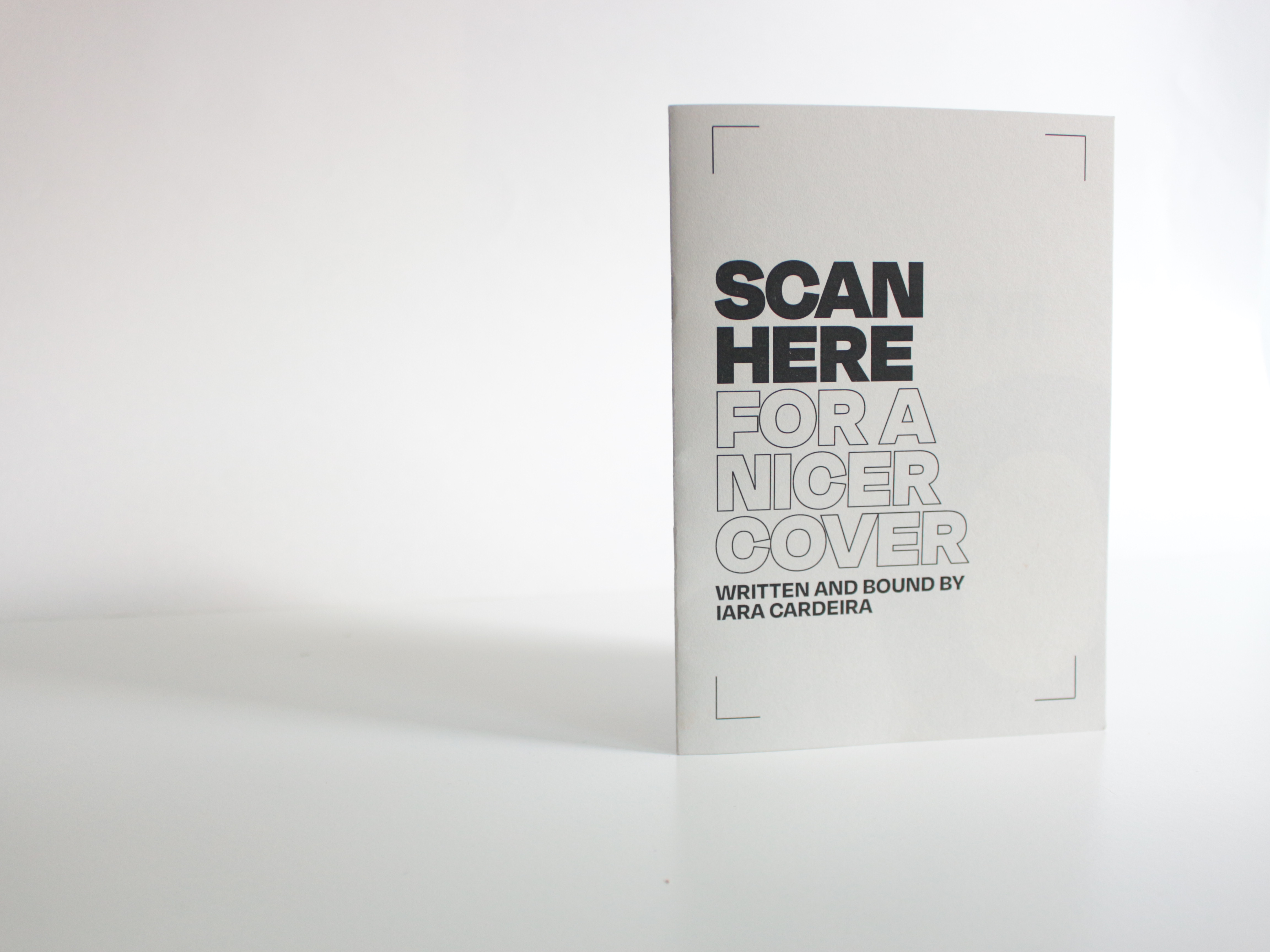
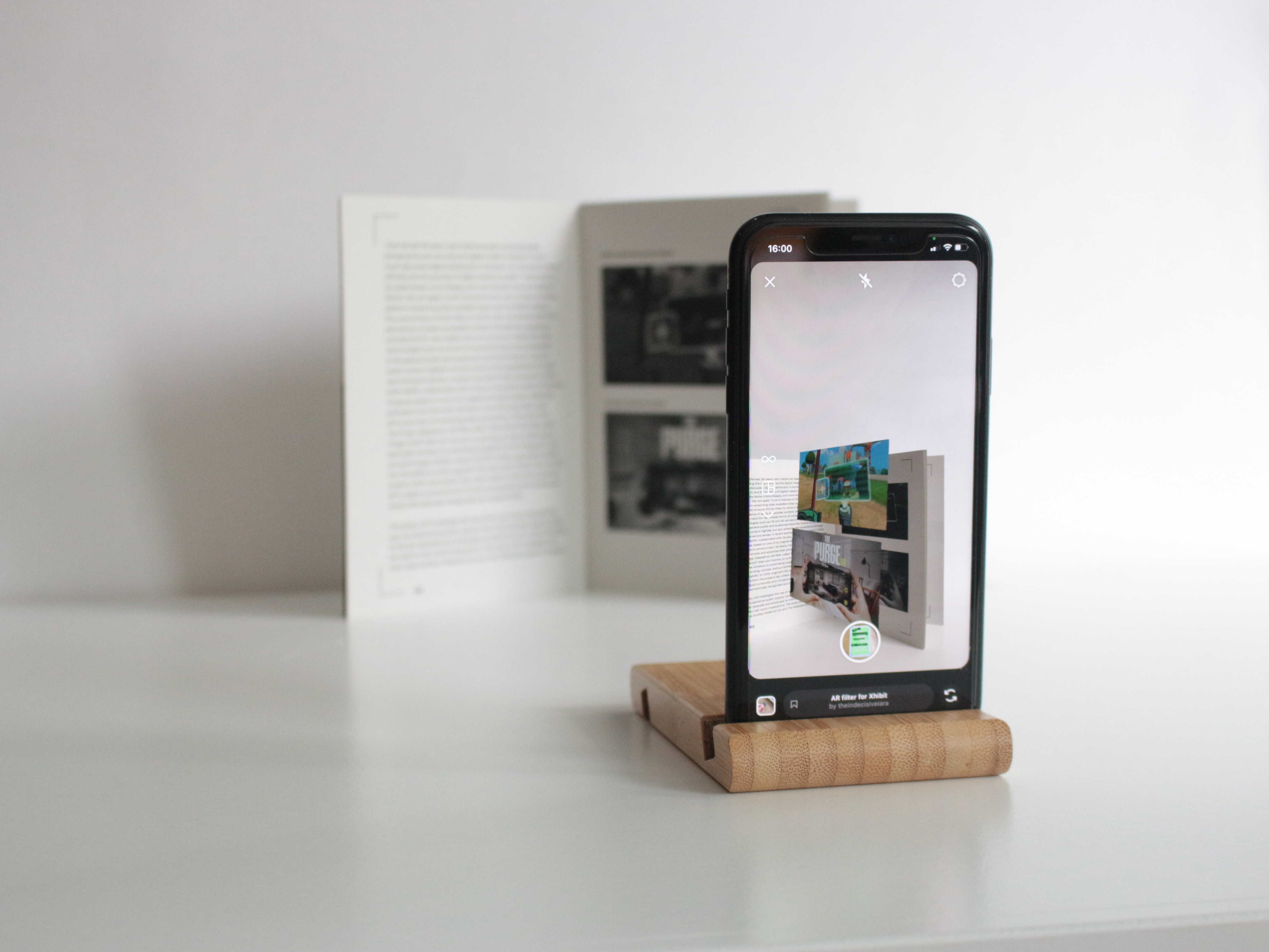
Scan Here: For A Nicer Cover
London, July 2022
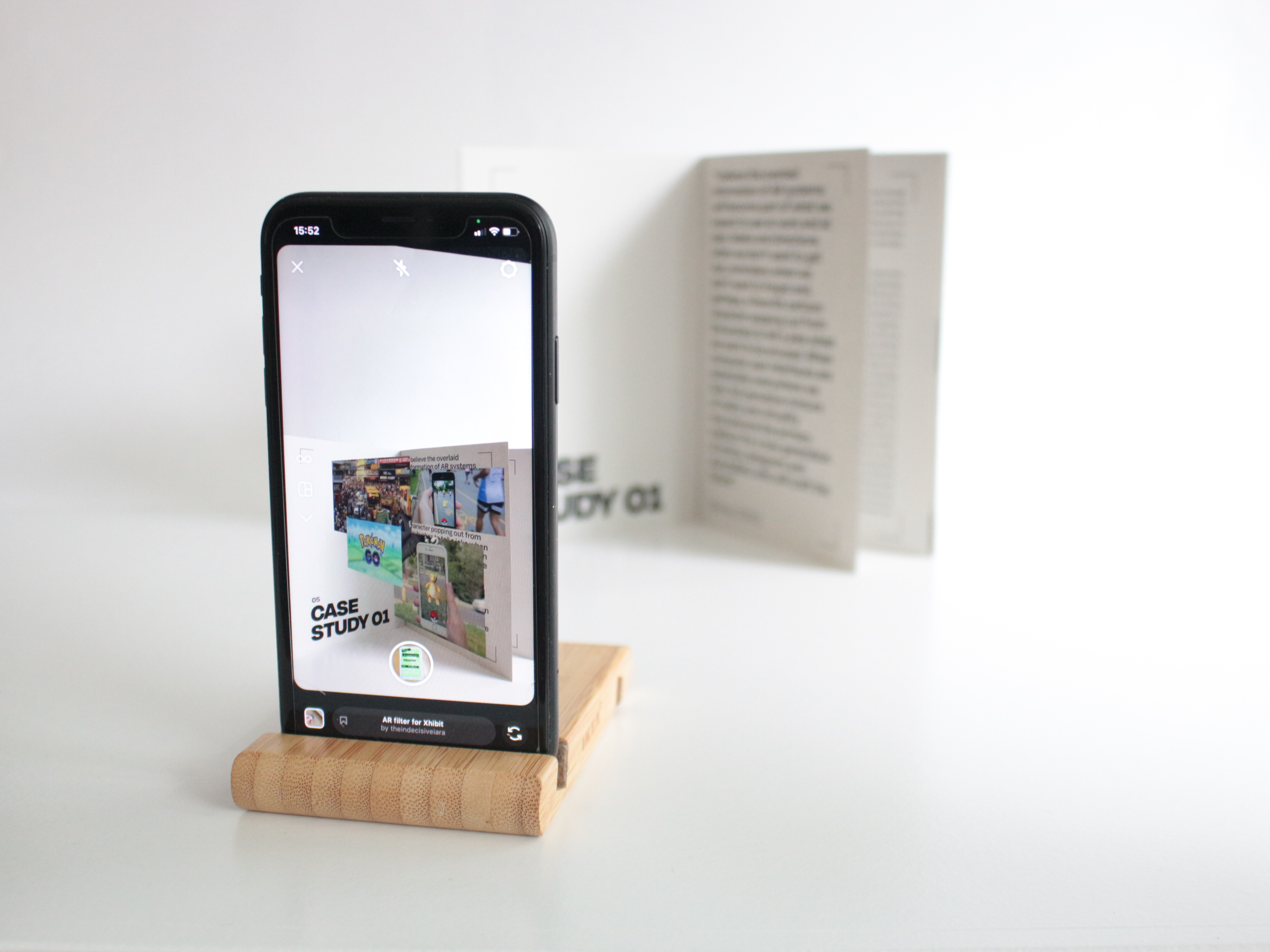
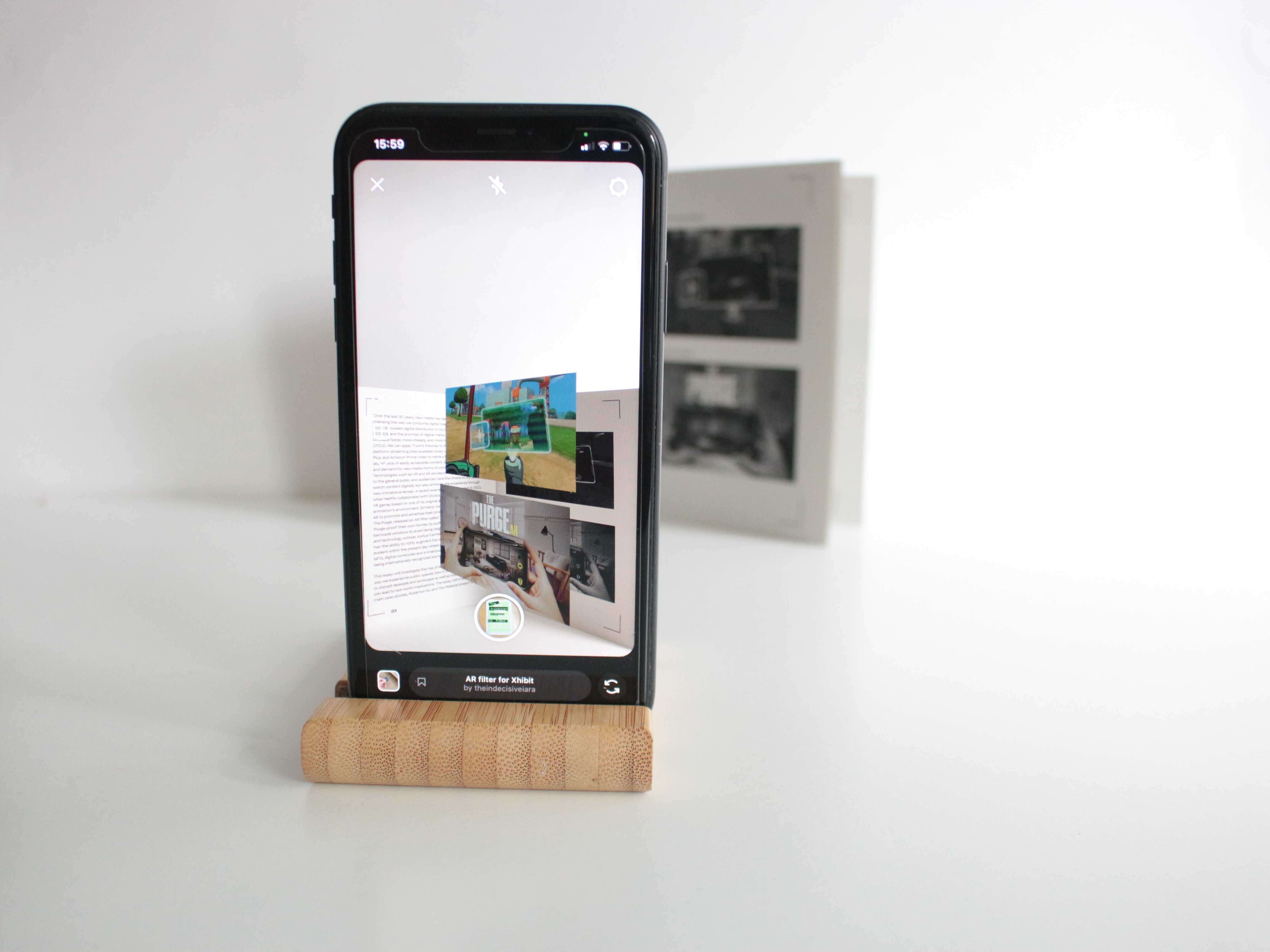
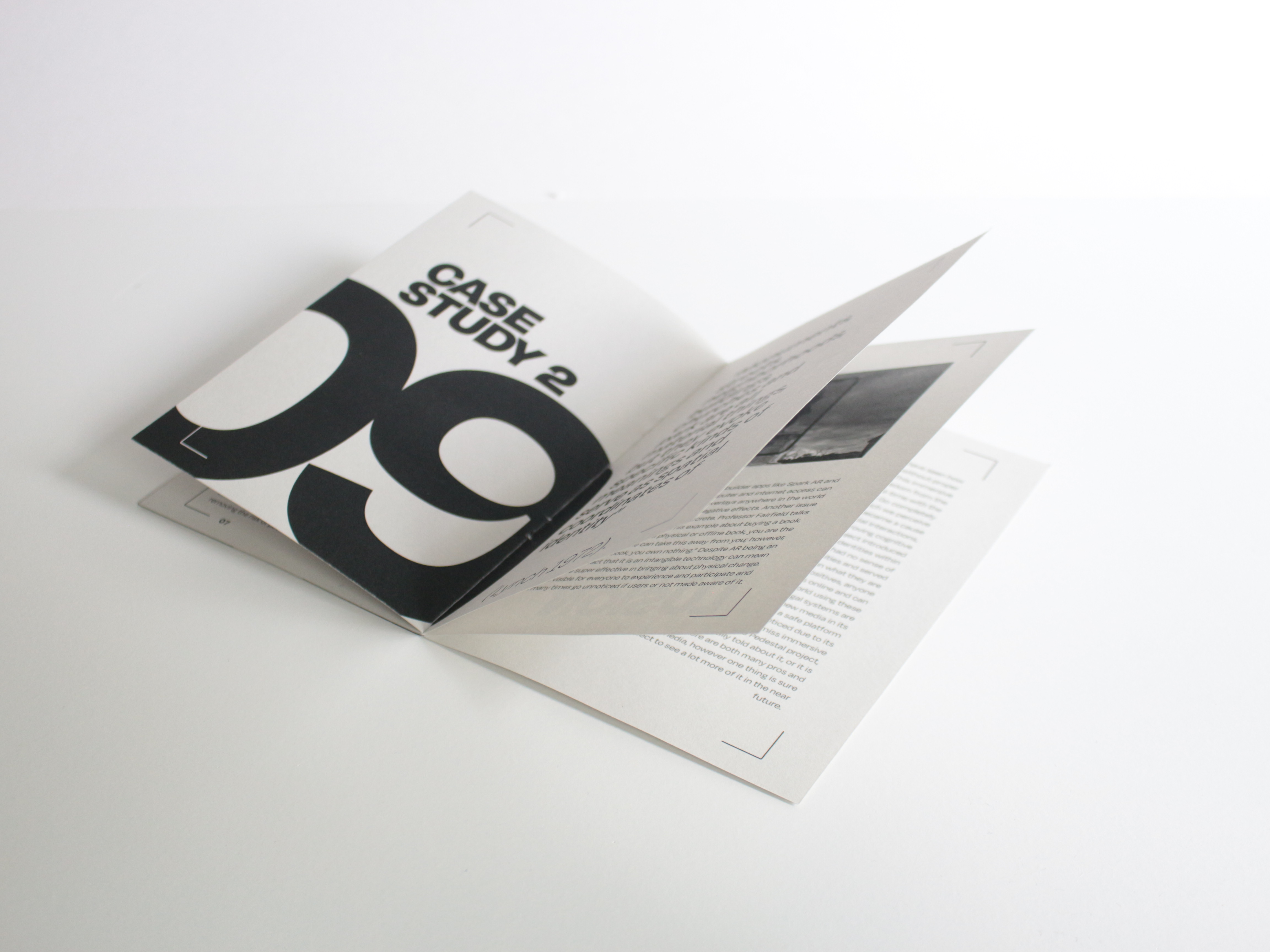
This Project, Scan Here: For A Nice Cover is a A5
booklet designed around my Long
form, Short form piece on topic of
AR.
This paperback is an essay on augmented reality and the way companies and charities are using them today. The book incorporates filters that lets the viewer see additional photos that didn’t make it into the physical book. but also incorporates RBG images into a cmyk format providing a clearer and brighter image quality. The filter more importantly allows the book to stay updated through real-time edits.
Images
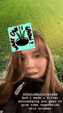
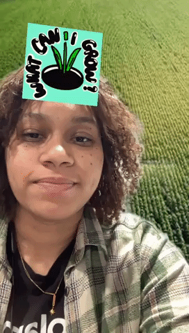
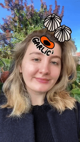
Iara Cardeira x Sophie Adelaide-Kear
Seasonal Vegetable AR Filter
Seasonal Vegetable AR Filter
What Can I Grow?
London, October 2022
For this project, I collaborated with fellow designer, Sophie Adelaide-Kear to create a fun and informative instagram filter that would educate viewers on what seasonal veg they can grow. This was a result of thinking about how we could bring awareness on the topic of food waste in the UK. Supplying people with a short list of different fruits and vegetables each month could potentially get people thinking about growing their own veg or atleast knowing what is in season when they visit shops. I used Spark AR to create the filters along with the illustrations drawn by sophie which we then published on Instagram, the 4th most popular social media platform in the world (2022).
Videos
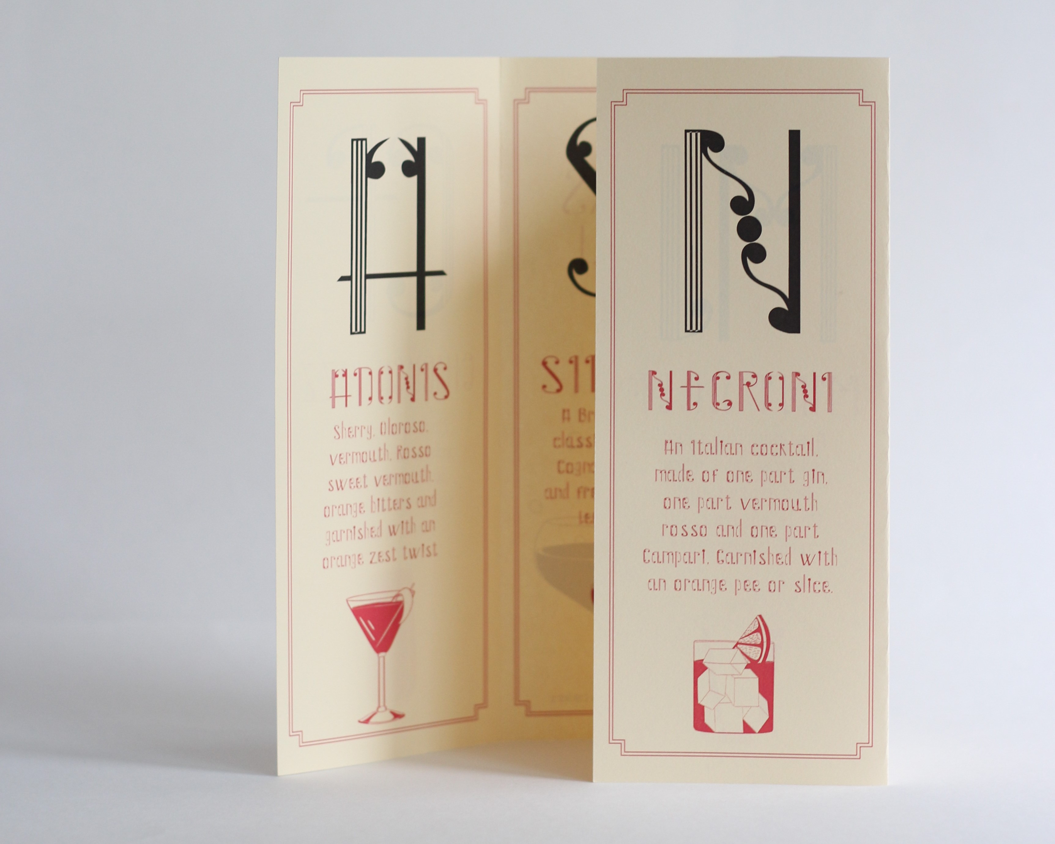
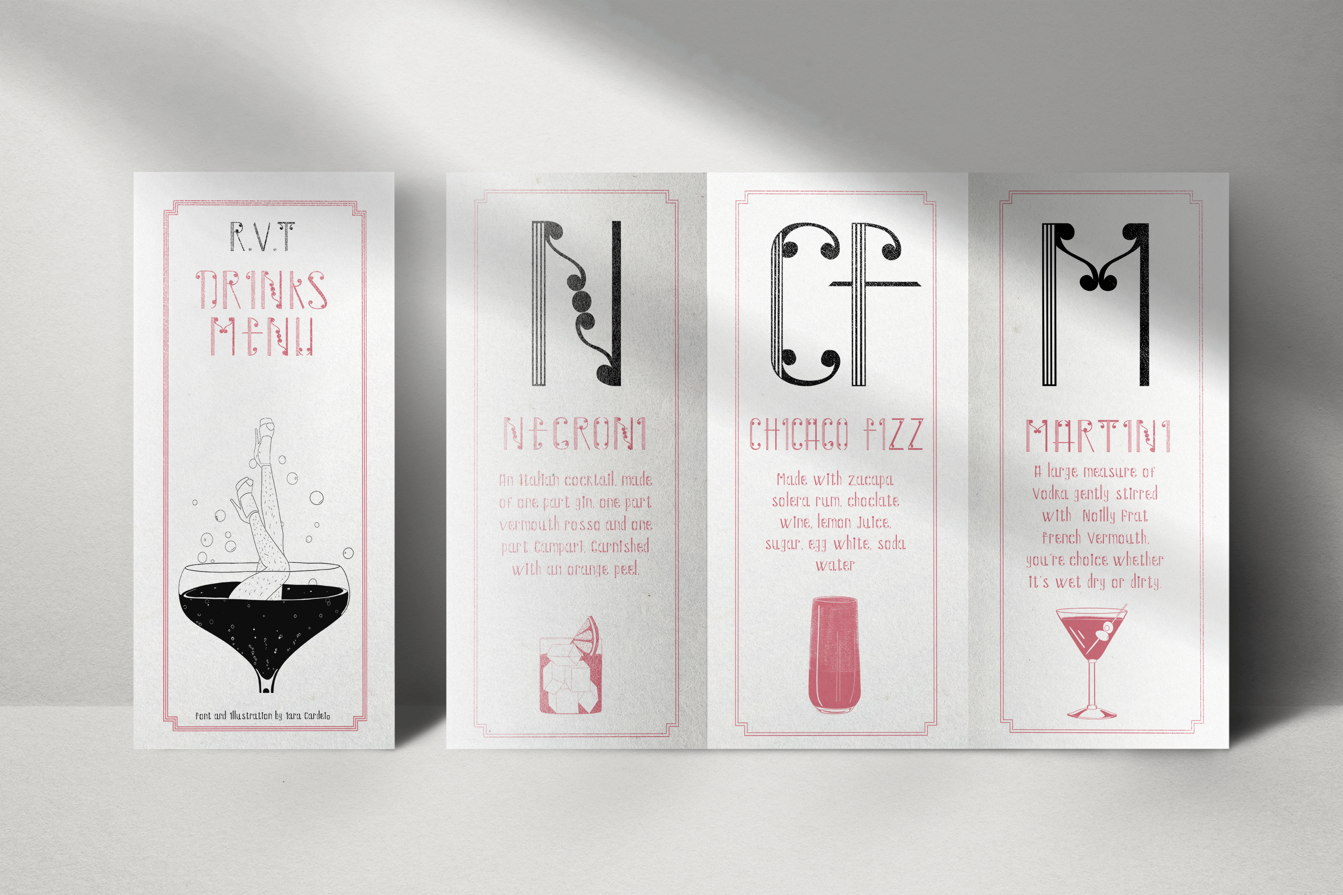
Type Design, Royal Vauxhall Tavern
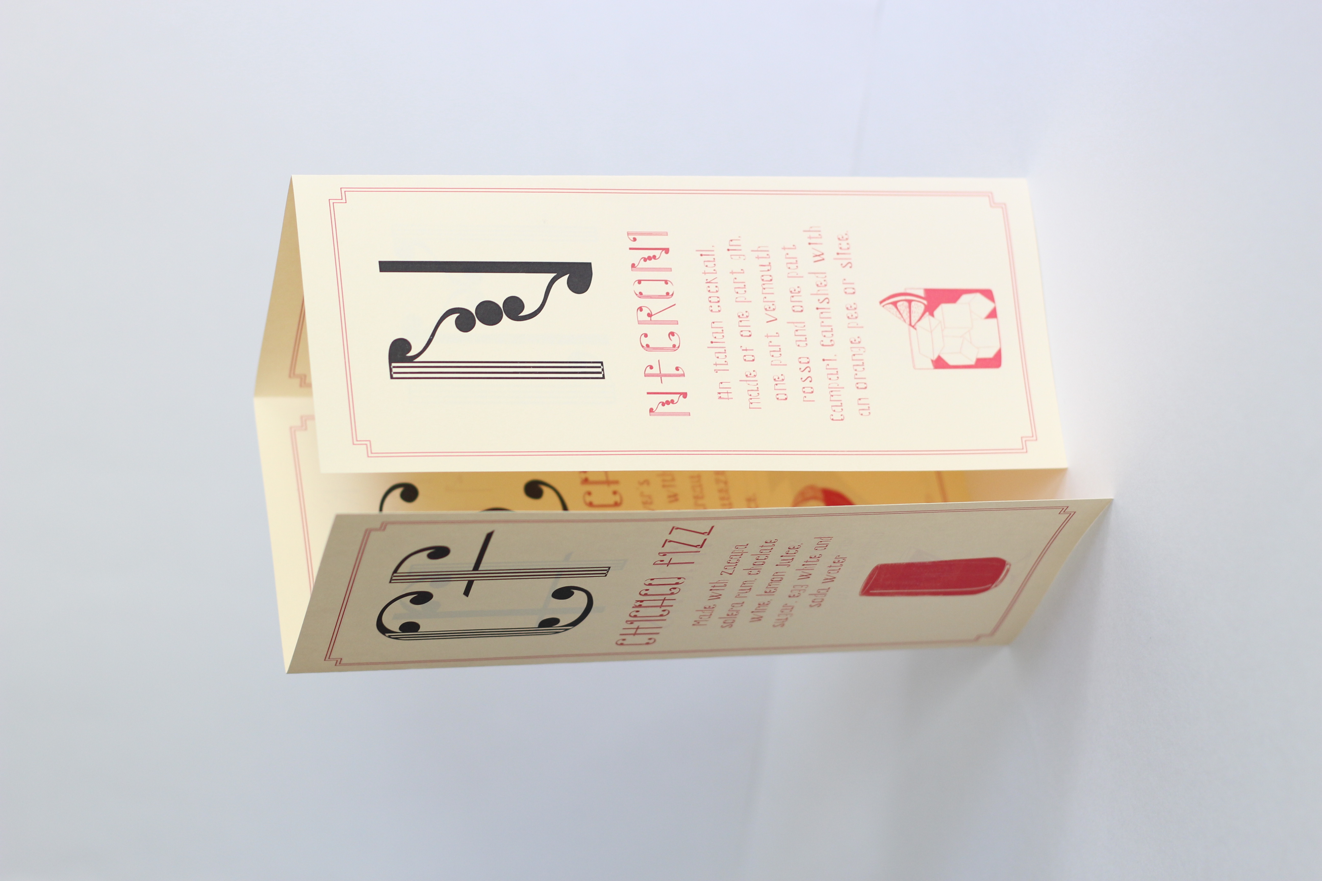
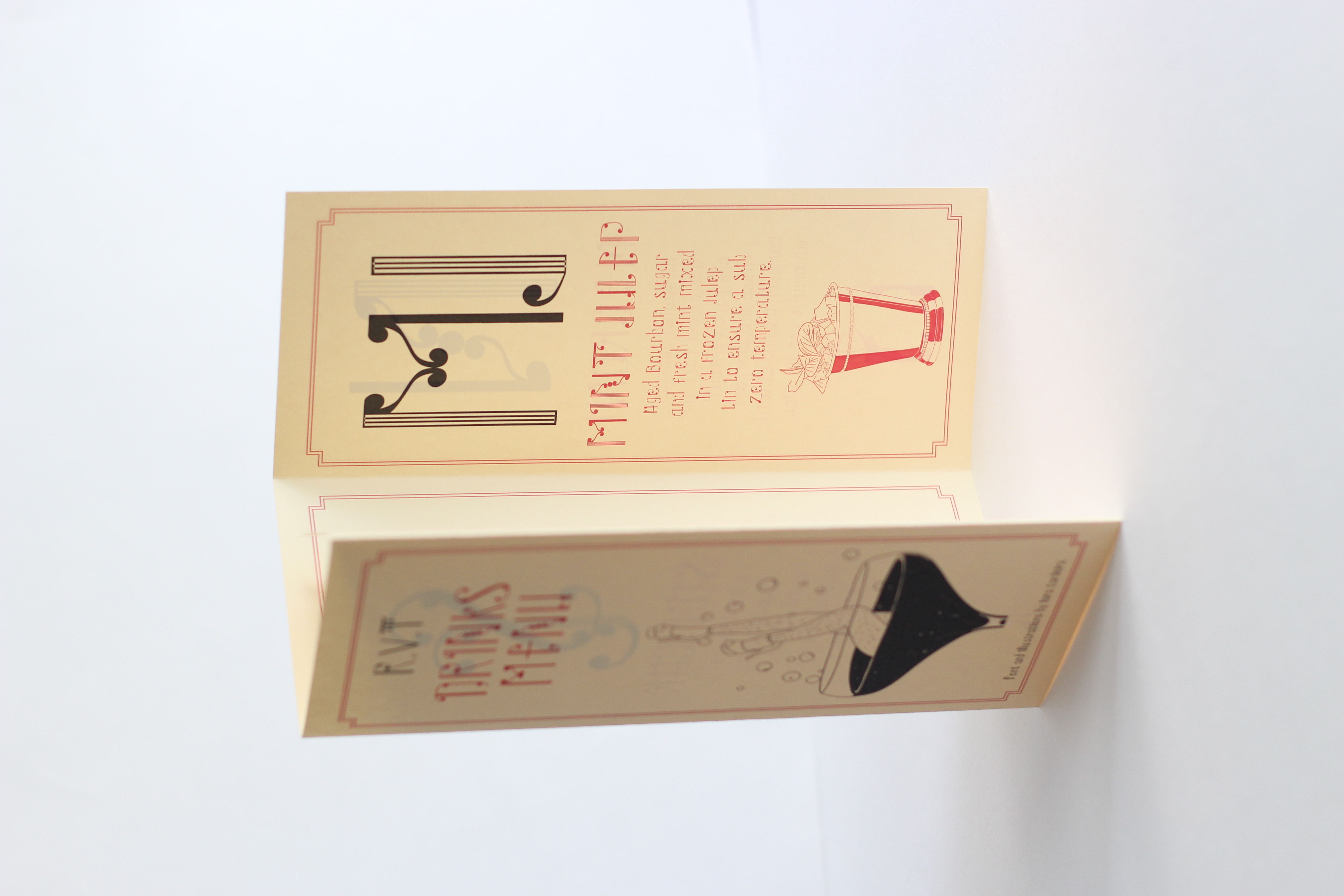
Type Specimens
London, Jan 2022
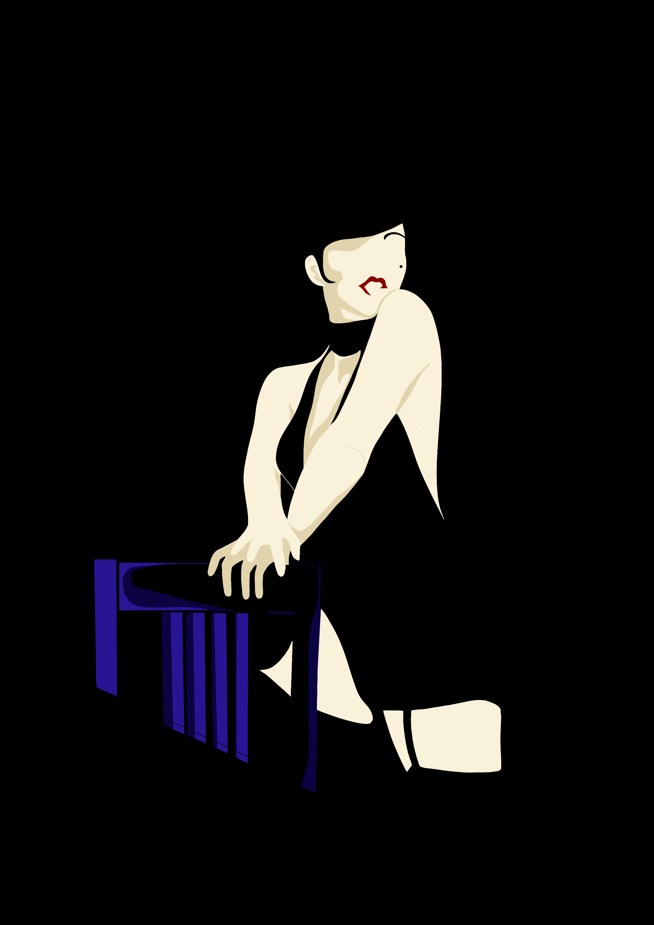
For the type specimens, I took inspiration from the Art Deco style posters of the 20s. Where women were
dressed in slapper outfits with fancy glasses od champagne in their hands. These images gave of a
sense of decadence with was something I was also trying to achieve in my own typecase. I titled my
typecase ‘Drag Decadence’ as drag is normally seen as quite playful, risque at times, adding this extra
layer of decadence and class gave it more formal look. See more here
Images
Various works
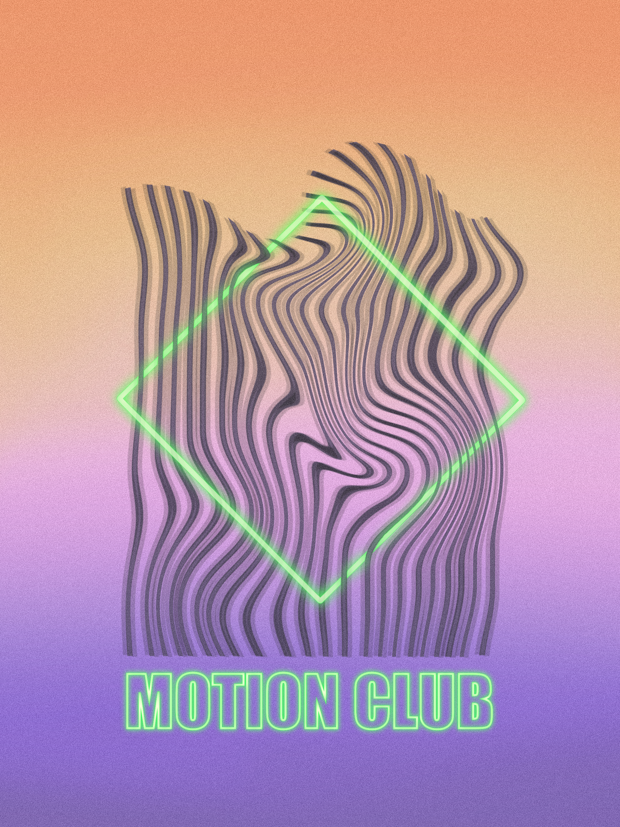
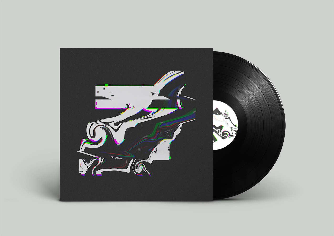
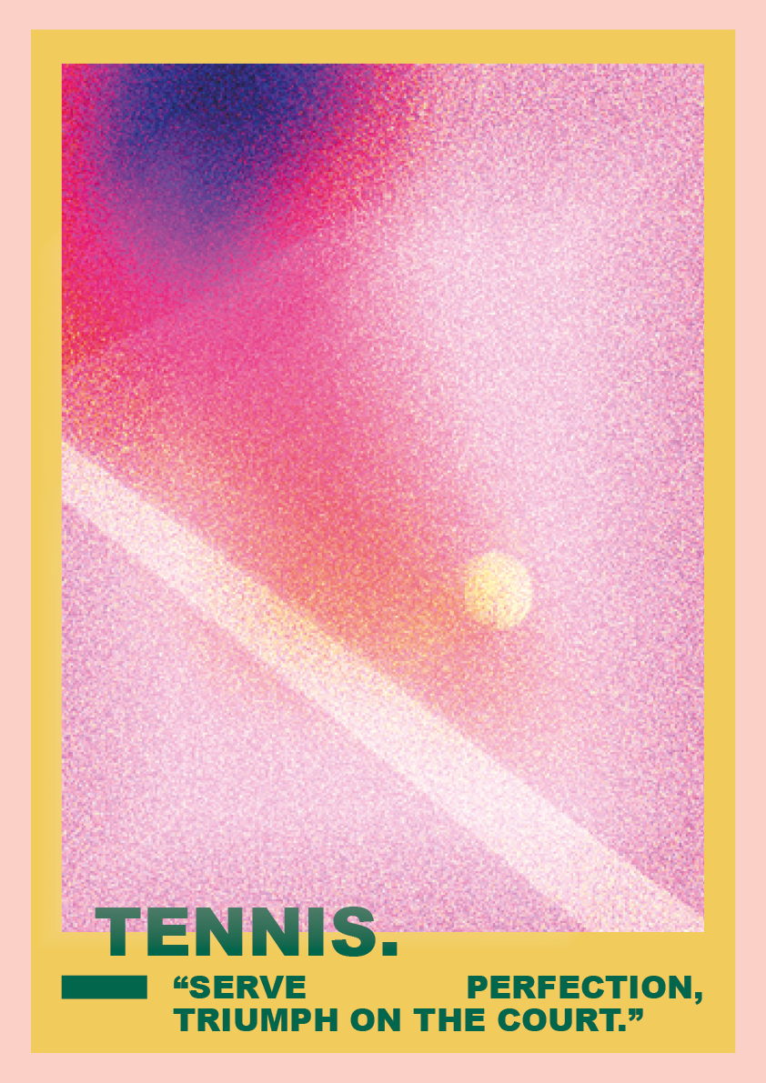
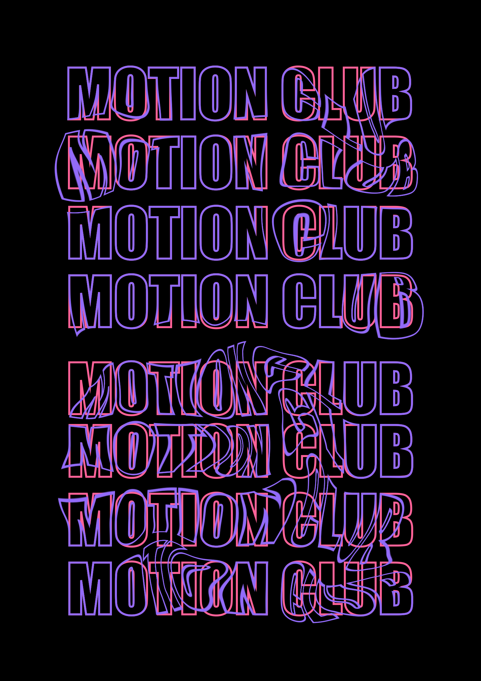
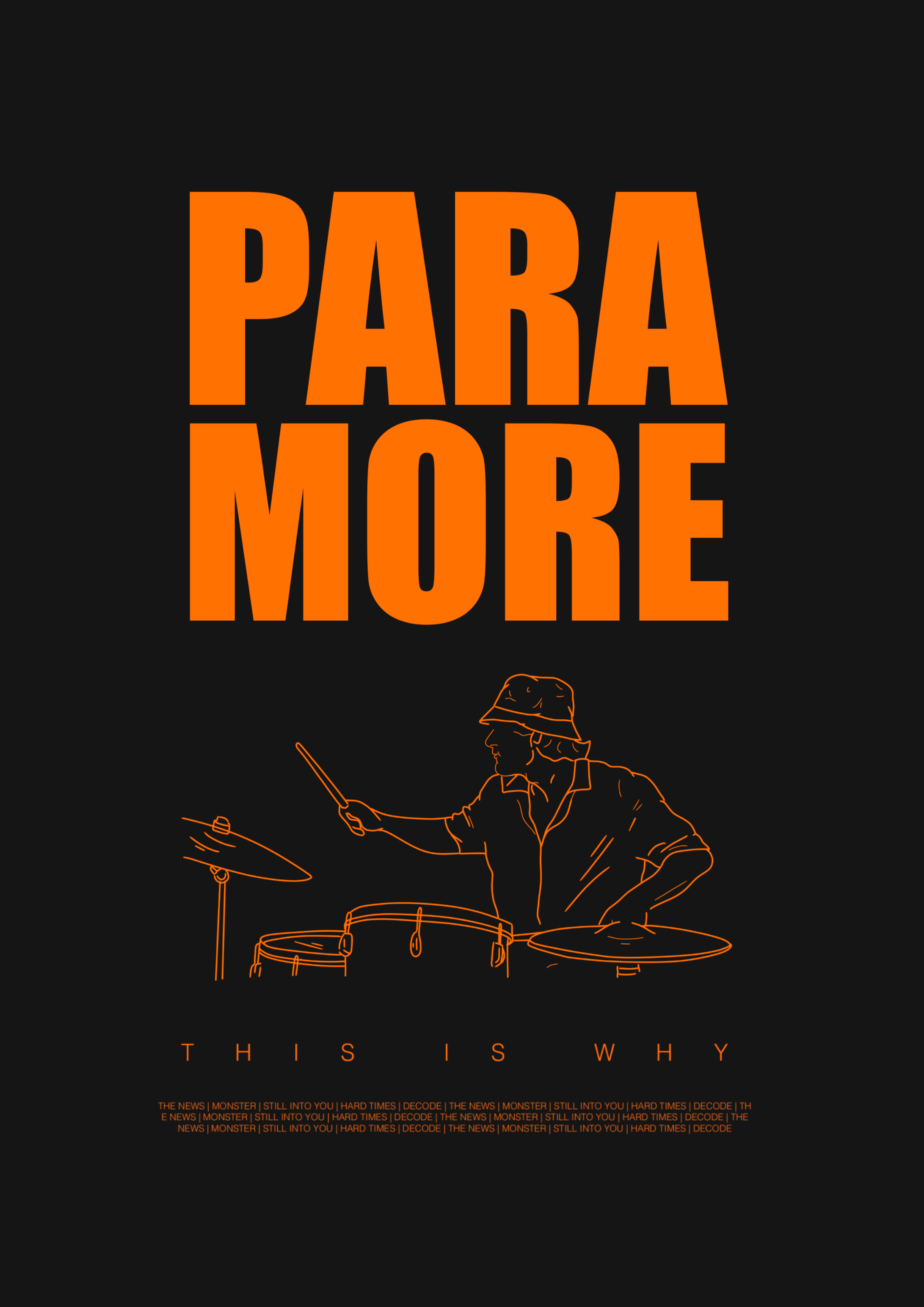
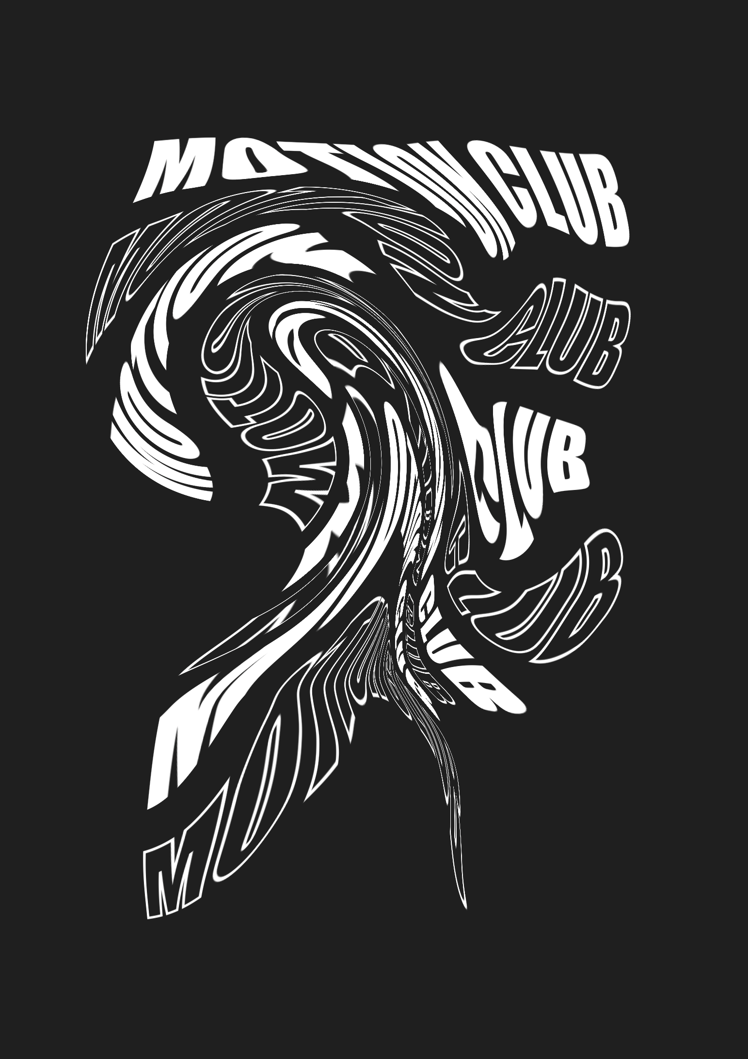
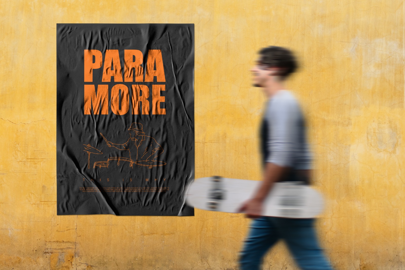
Posters
London, 2021 -
The series of posters a collection of digital art that showcases my creativity and design skills. Each poster is carefully crafted to captivate the viewer with its unique style, color palette, and composition. Using various digital tools and software, I have experimented with images, typography, and graphics to create posters that are visually striking and highly impactful. The posters are designed to communicate a clear message or concept, whether it's promoting a event or concept.
Images